Project Overview
The Product
Following ‘Flower Shoppe’ the flower ordering and delivering mobile
app I designed, I chose to make responsive web designs with the same
theme, creating the website ‘Bouquet Boutique’.
View 'Flower Shoppe' Case Study
Project Duration
October 2023
My Role
Lead UX Designer in the creation of the responsive website, ‘Bouquet Boutique’ from concept to hand off to developers and engineers.
My Responsibilities
Designing paper and digital wireframes, creating low and high fidelity prototypes, developing mockups, accounting for accessibility and iterating on designs.
Starting The Design
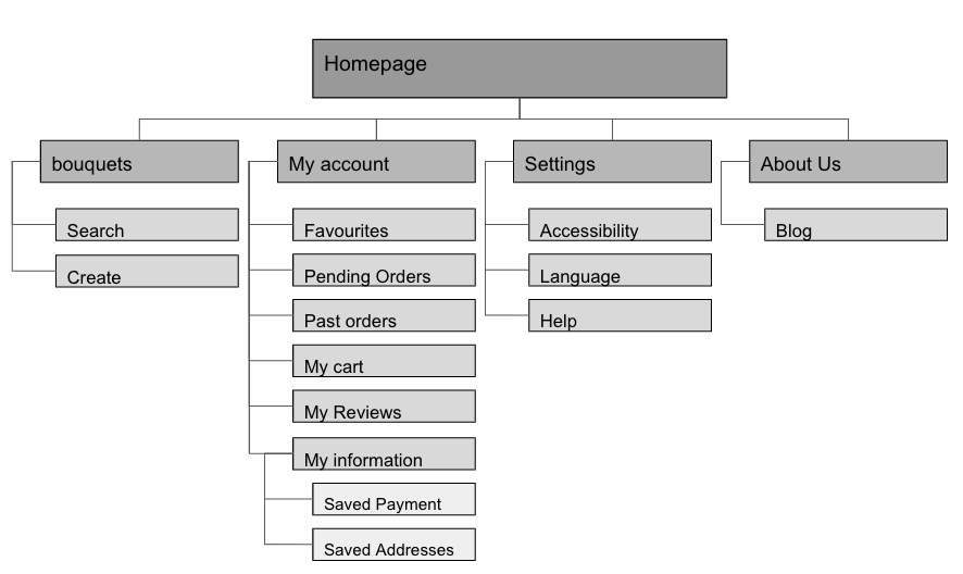
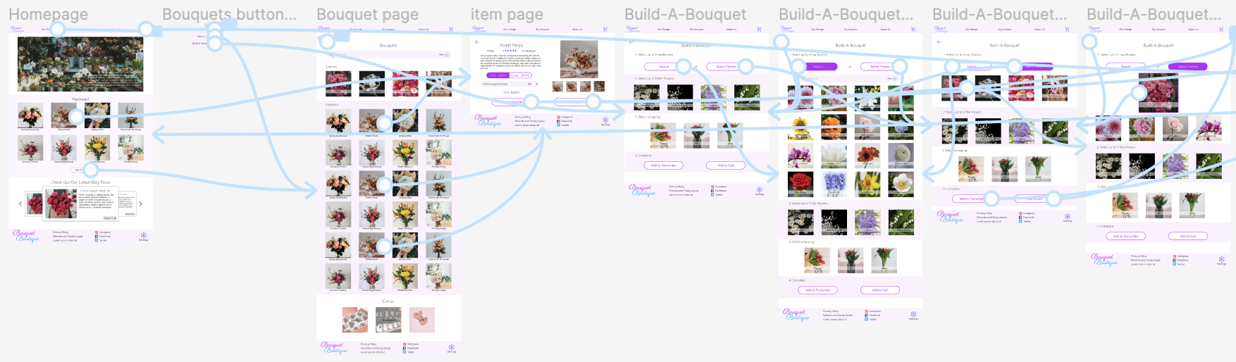
Sitemap
I wanted all aspects of the website to be accessible from all pages of the website, so I implemented a navigation bar at the top of the page allowing access to each respective page of the site.
Paper Wireframes
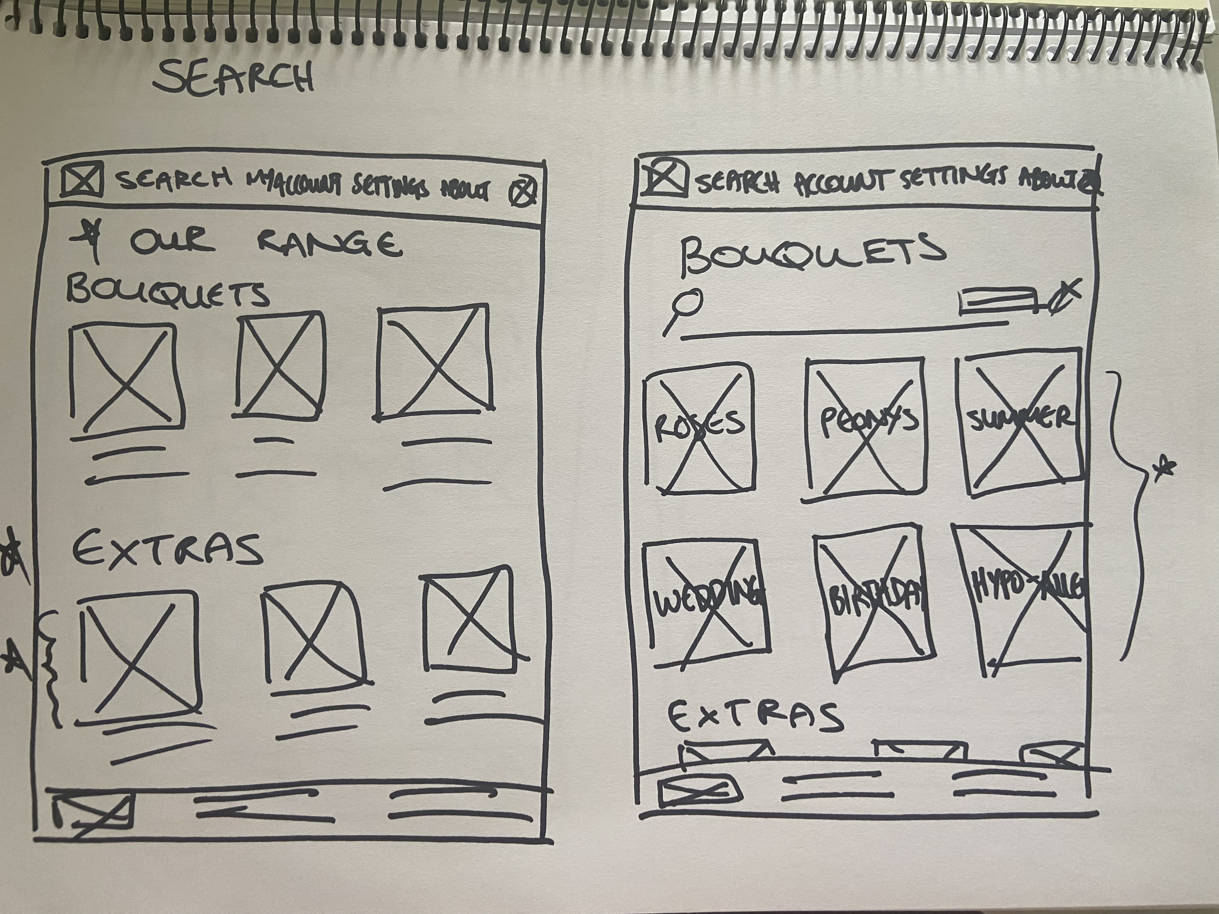
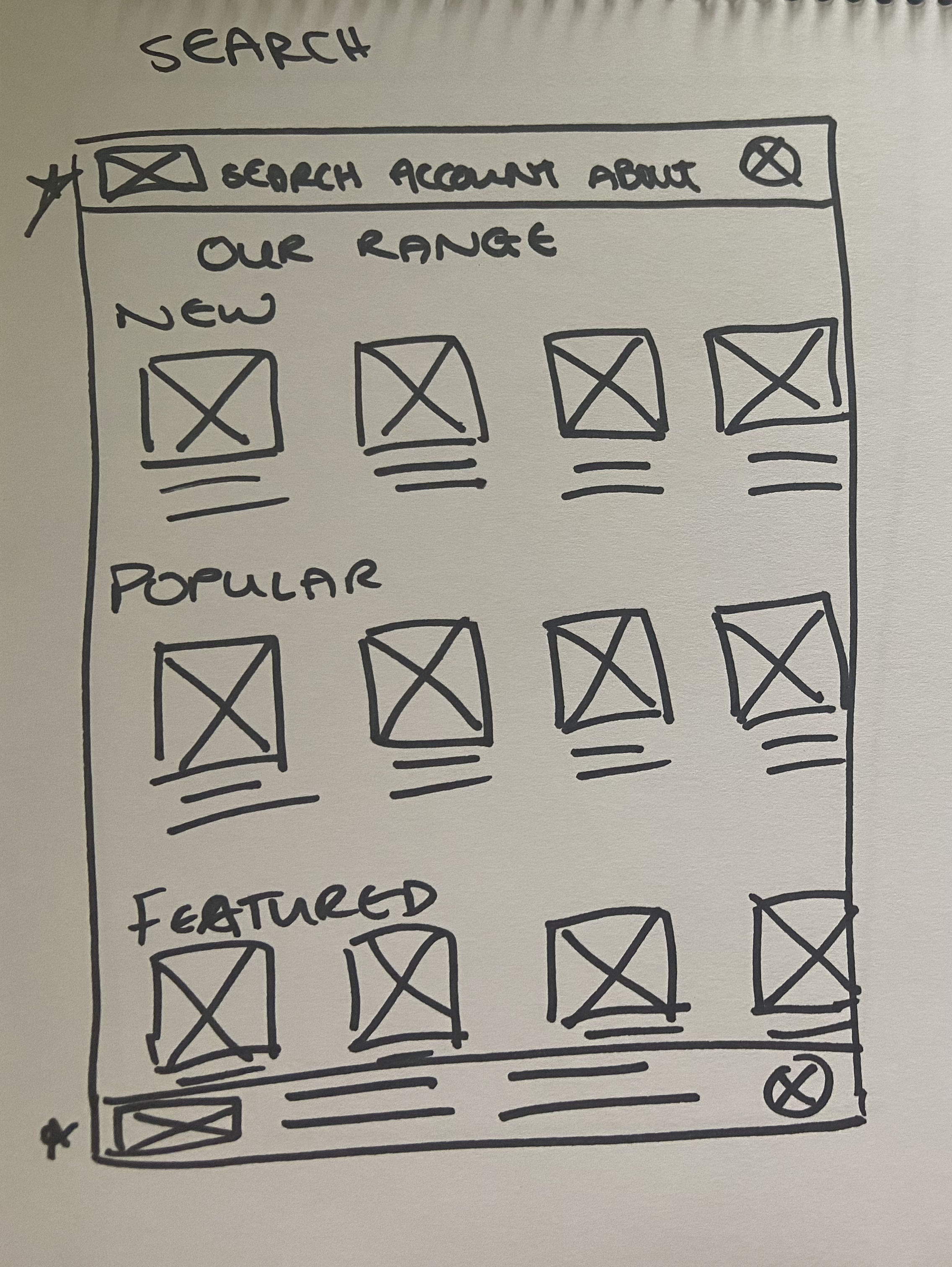
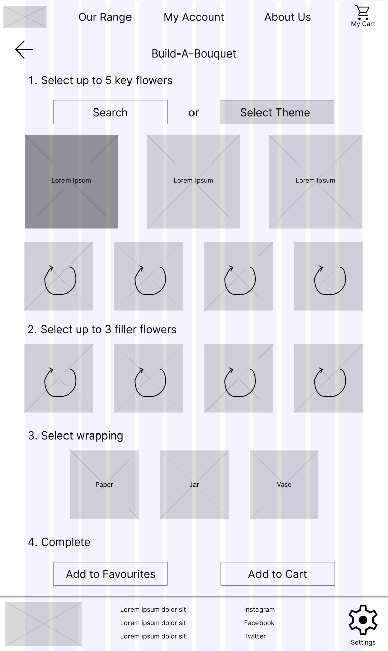
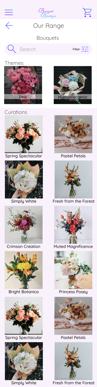
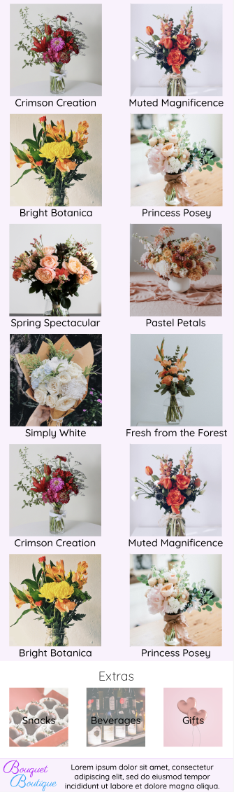
‘Search Page’ - I wanted the search page to have two distinct sections, a section of bouquets and a smallers section at the bottom for extras. I thought it was necessary for the page to have a search function as well as a an option for users to select from themes.
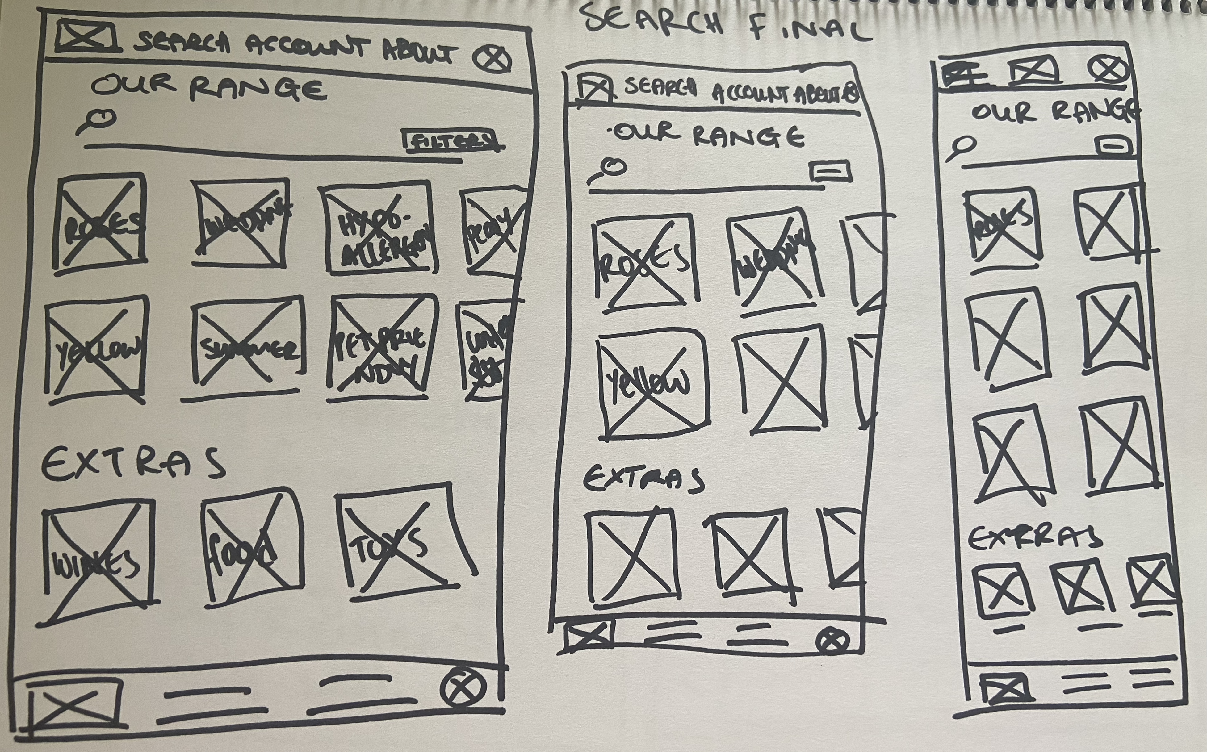
‘Search Page’ - Rapid Sketching
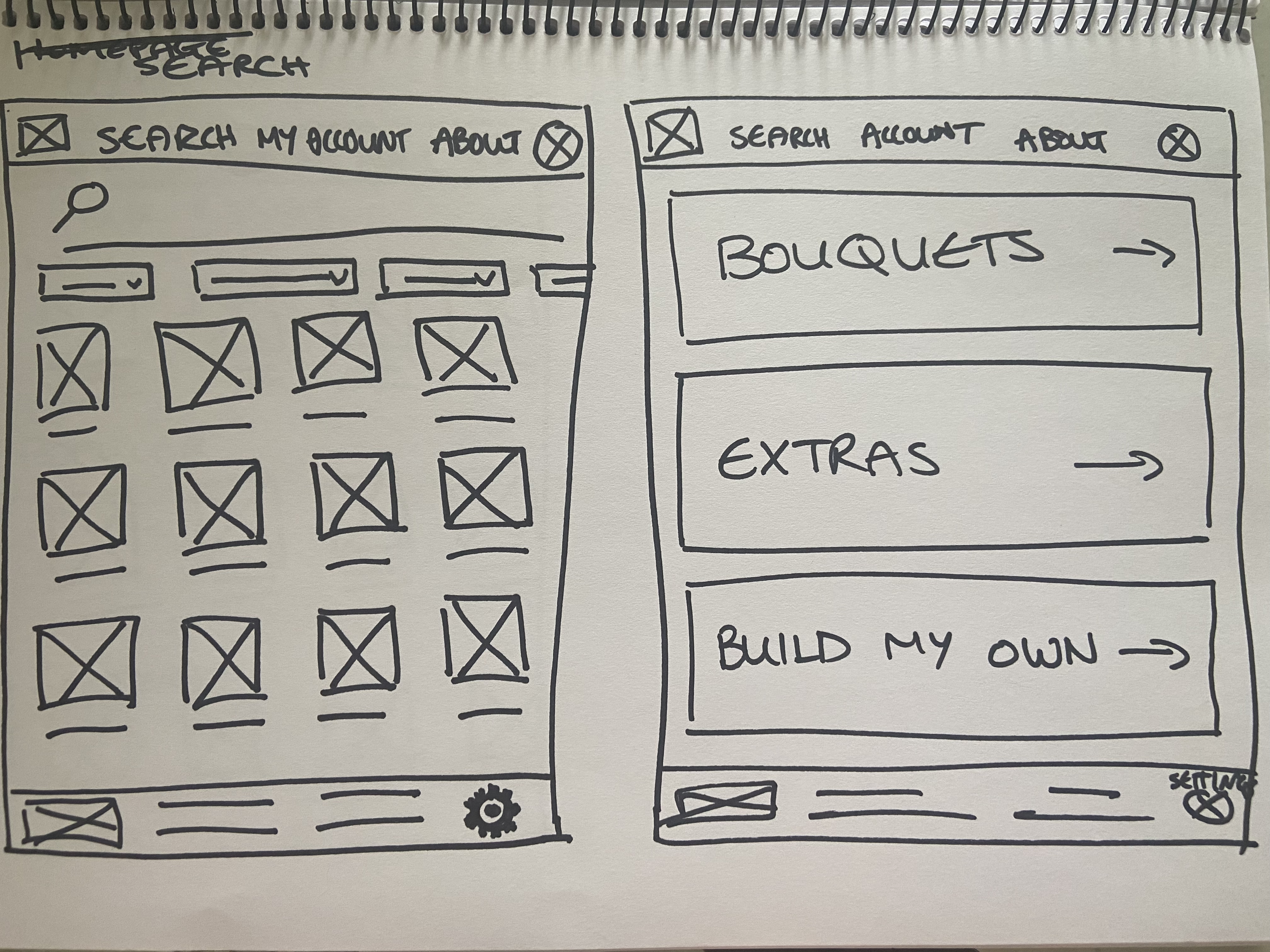
Screen size variations
‘Search Page’ - I designed the final page for the search page and created a rough tablet size and phone size respectively to show the layout on different screen sizes
'Search Page' - Final
Digital Wireframes
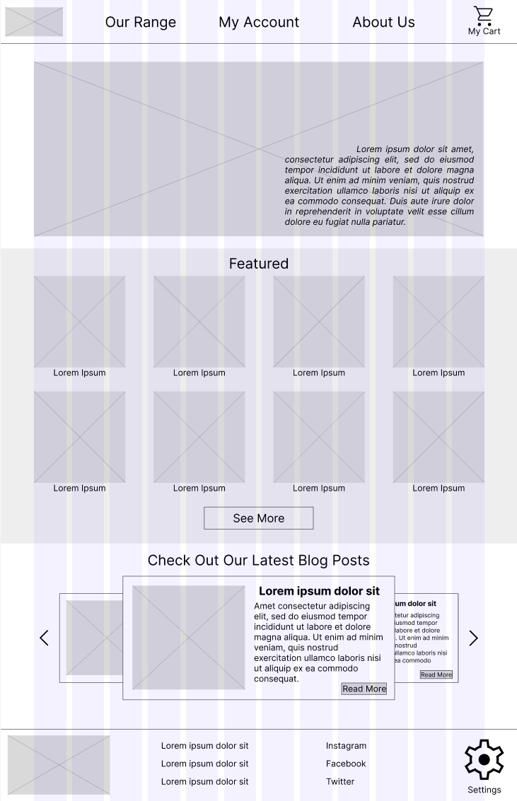
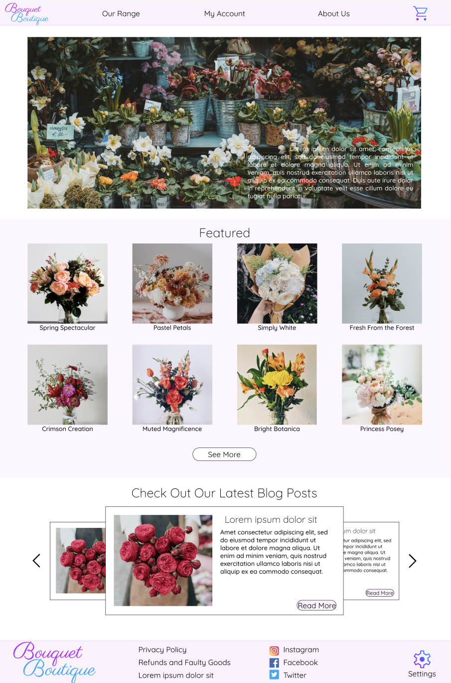
Homepage
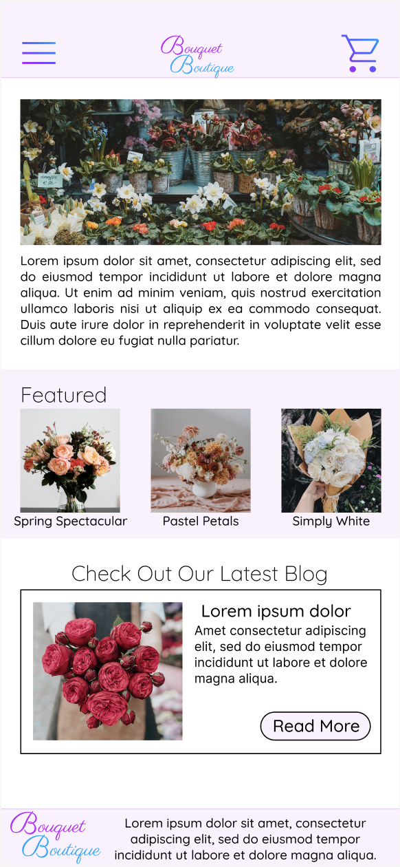
The Homepage is designed to be clear and easy for users to browse, following recommendations of a simpler homepage design and the main action of the site (purchasing flowers) closer to the top of the page. There is a navigation bar at the top of the page as well as a bottom bar. The homepage features a hero image at the top with a short description about ‘Bouquet Boutique’, this is followed by a few featured bouquets with a see more button leading to the bouquet catalogue and finally a blog post carousel at the bottom.
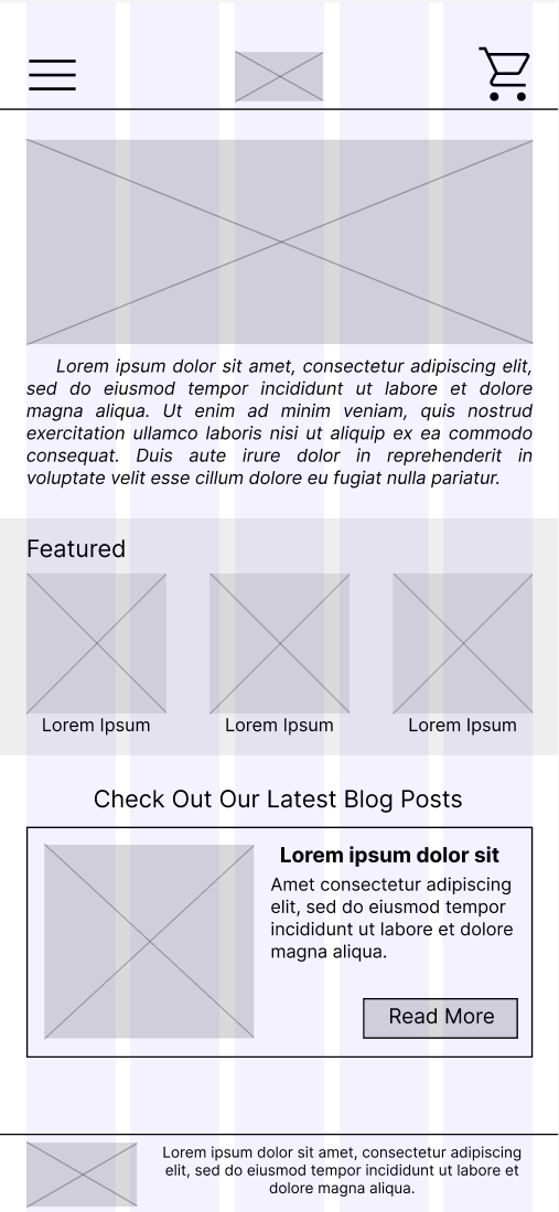
Homepage - Screen Size Variation
The homepage of the website on a mobile phone has been modified to accommodate for the smaller screen size. A hamburger menu has been used, and the description of ‘Bouquet Boutique’ has been moved off the hero image so the text size is visible. Furthermore the featured bar as well as the blog post section have both been converted to horizontal scrollers, taking up less space on the screen and creating a less cluttered layout.
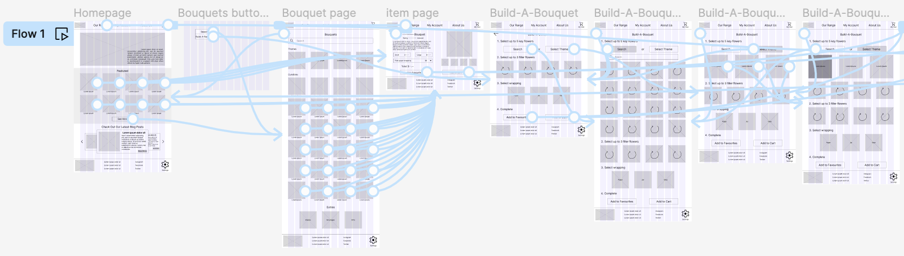
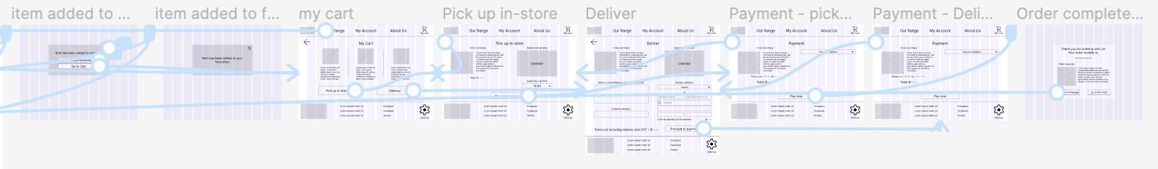
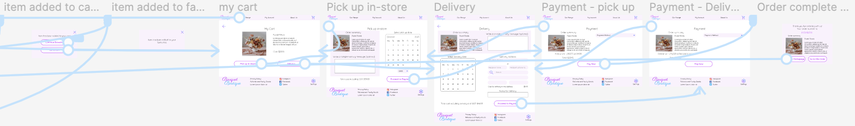
Low-Fidelity Prototype
The low-fidelity prototype allows the user to go through the process of ordering flowers with the options of pick-up or delivery.
Refining The Design
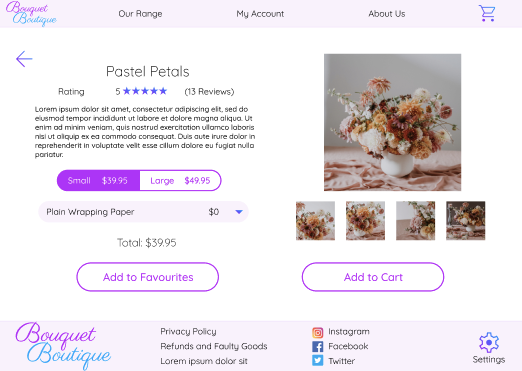
Mockups
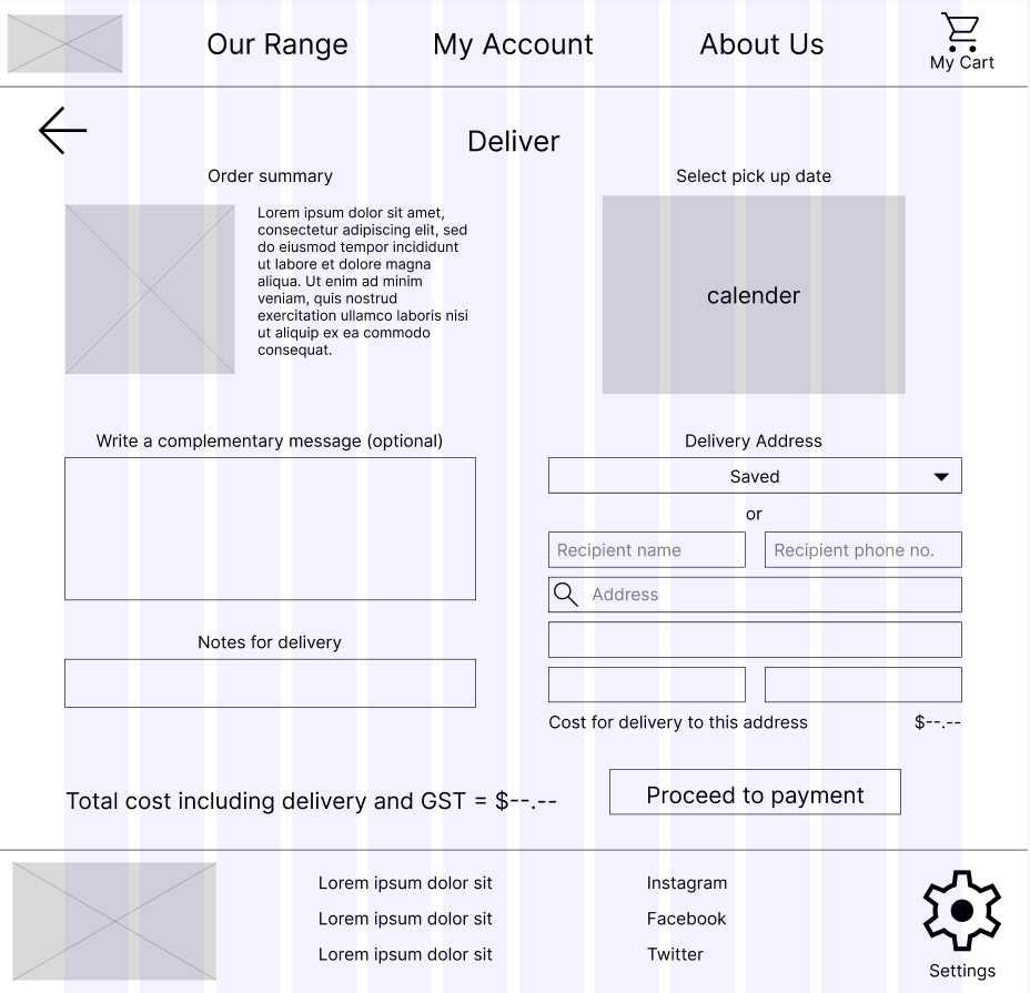
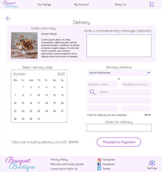
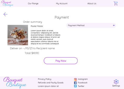
Delivery Page
Early designs showed the blog at the top of the home page, with the ‘Catalogue’ and ‘Build A Bouquet’ buttons further down. These key buttons were moved to the top of the page, with the ‘Catalogue’ button being made larger with a bigger font so customers will see this button first.
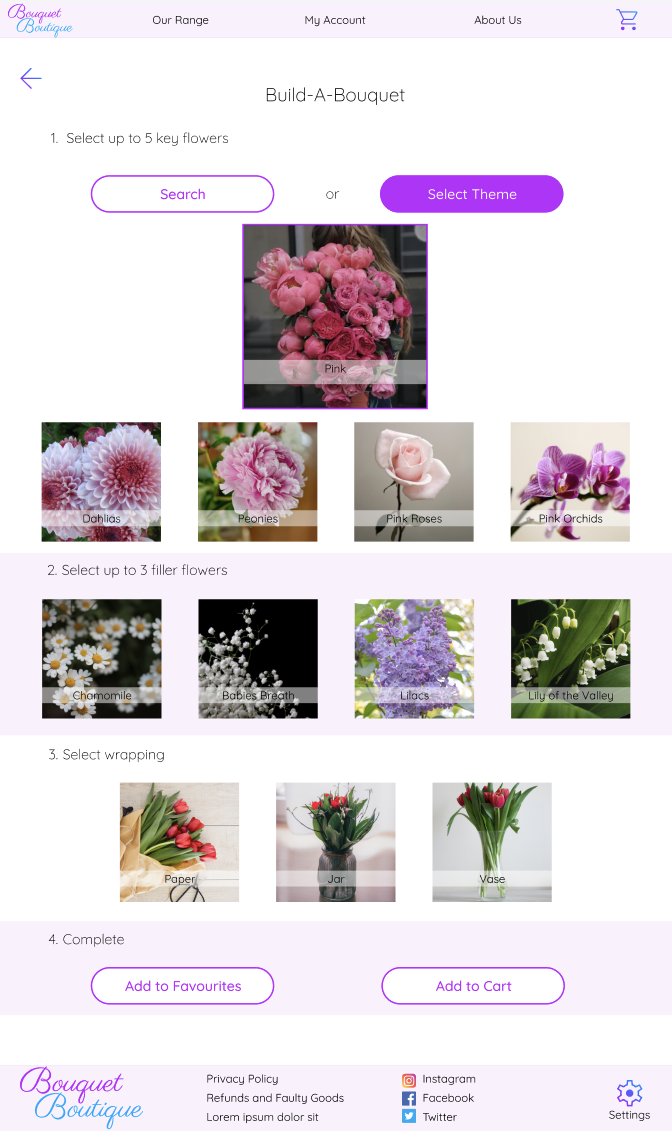
Build-A-Bouquet - Theme Selected Page
The layout of the page originally presented the themes in a scrolling bar row with the selected theme highlighted, however testing indicated that users were confused as to which theme was selected as the highlight wasn’t obvious. I modified the page so that the selected theme was moved to the centre, with all other themes removed and made larger. The theme can easily be unselected or changed by either clicking the back arrow at the top of the page or by clicking on the selected theme’s image to unselect it.
More Key Mockups
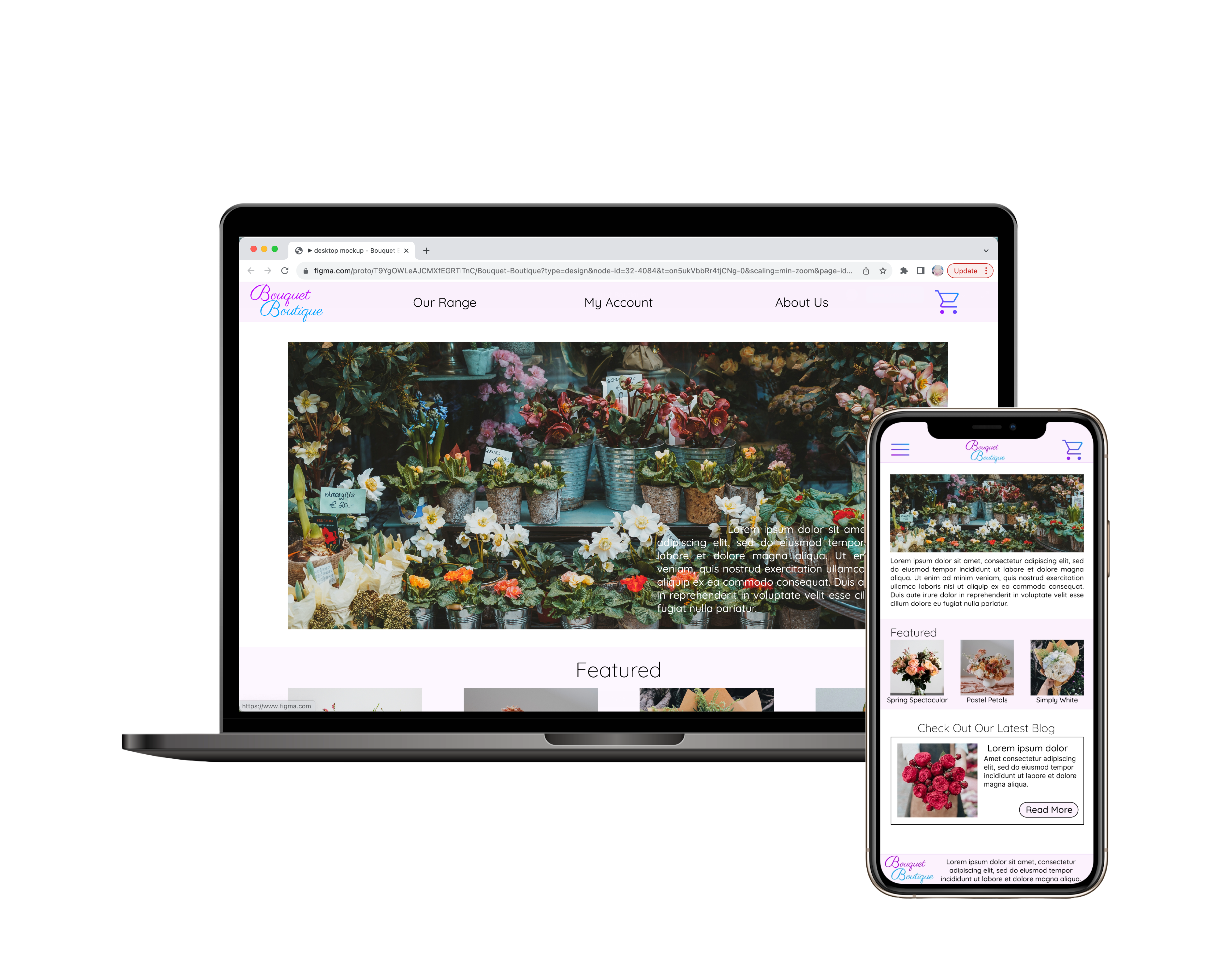
Desktop Website
Mobile Website
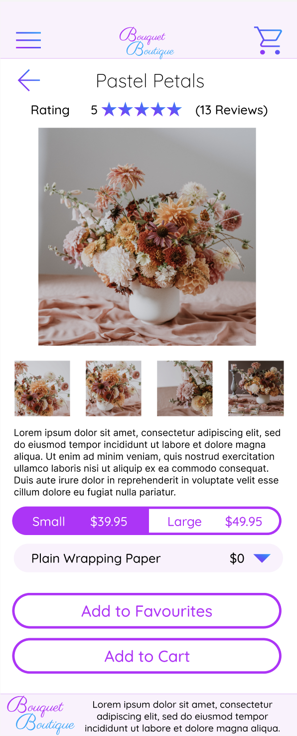
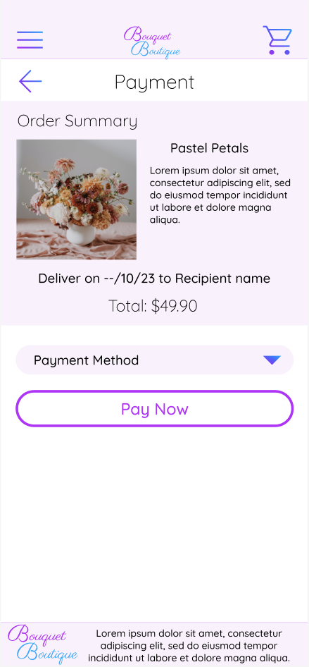
High-Fidelity Prototype
The final high-fidelity prototype includes images and prompts that allow the user to experience a close to final design of the website without misunderstanding as to what buttons have what function (e.g. drop-downs, selected/unselected).
Accessibility Considerations
-
1
The ‘Settings’ icon as well as its title is located at the bottom of the desktop website, allowing easy access and understandability on how to access the setting page. -
2
The colours chosen for text have been tested and pass the WCAG AA standards. -
3
All call-to-action buttons are the same height and shape and have been highlighted using the same HEX #BD00FF so that users know they have a similar function.
Going Forward
Takeaways
Impact
The website allows users to determine the ethics of ‘Bouquet Boutique’ and personalise their own creations by creating an account, saving addresses, favouriting and designing their own bouquets.
What I Learned
I learned that often multiple pages are needed to be developed of simple actions in order to create a smooth user flow and to ensure usability of different buttons.
Next Steps
-
1
Conduct further usability studies to ensure pain points have been sufficiently met and no new pain points arise. -
2
Complete other pages of the website to ensure a complete website is developed before the site is launched. -
3
Scale down certain elements of pages to ensure they fit above the fold on desktop screens where possible to create a better user experience.