Project Overview
The Product
Flower Shoppe is regional flower purchasing and delivery app, striving to create a personal experience for users, as well as having various settings to improve accessibility for users and the inclusivity of the app.
Project Duration
September 2023 - October 2023
The Problem
Users lack time to personally select and deliver flowers.
The Goal
Design an app that allows users to order and deliver personalised flower bouquets.
My Role
Lead UX Designer and UX Researcher designing an app for Flower Shoppe from concept to delivery.
My Responsibilities
Conducting user research, designing paper and digital wireframes, creating low and high fidelity prototypes, conducting interviews and usability studies, developing mockups, accounting for accessibility and iterating on designs.
Understanding the user
User Research: Summary
In order to gain an understanding on prospective customers, I
conducted interviews and developed empathy maps to group together
common pain points between users. A main user group found were busy
adults that don’t have time to personally go and select flowers,
especially within working hours.
This confirmed earlier
assumptions that users often don’t have enough time in their
schedules to choose flowers. It also revealed that users often don’t
have time to personally deliver flowers either. I also found that
users were unsure on what flowers to gift and often felt overwhelmed
by the large selection of flower options.
User Research: Pain Points
-
1
Time
Users often don’t have enough time to personally go and select flowers, or to make it to the florist during opening hours. -
2
Loyalty
There are not many flower delivery companies which provide loyalty services to customers, allowing them to personalise their experiences. -
3
Accessibility
Flower delivery sites are often non-accessible to people with impairments and who don’t speak English. -
4
App
Currently there is no app for any flower delivery service, all must be purchased through websites, making it hard to access, especially for returning customers.
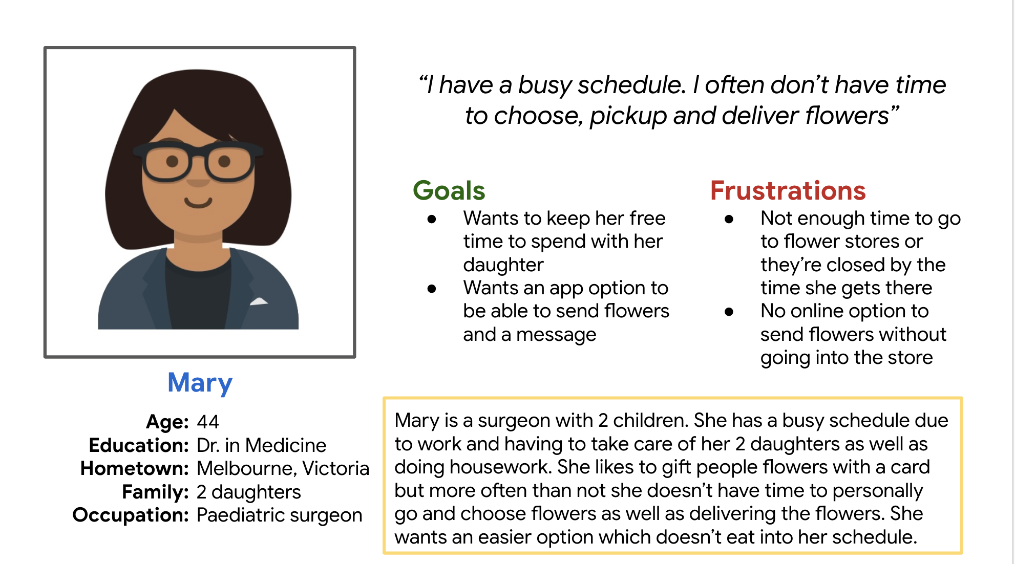
One of two created personas - Mary
Problem Statment
Mary is a busy mum who needs an app to purchase and deliver flowers because she doesn’t have time to select and deliver them in person.
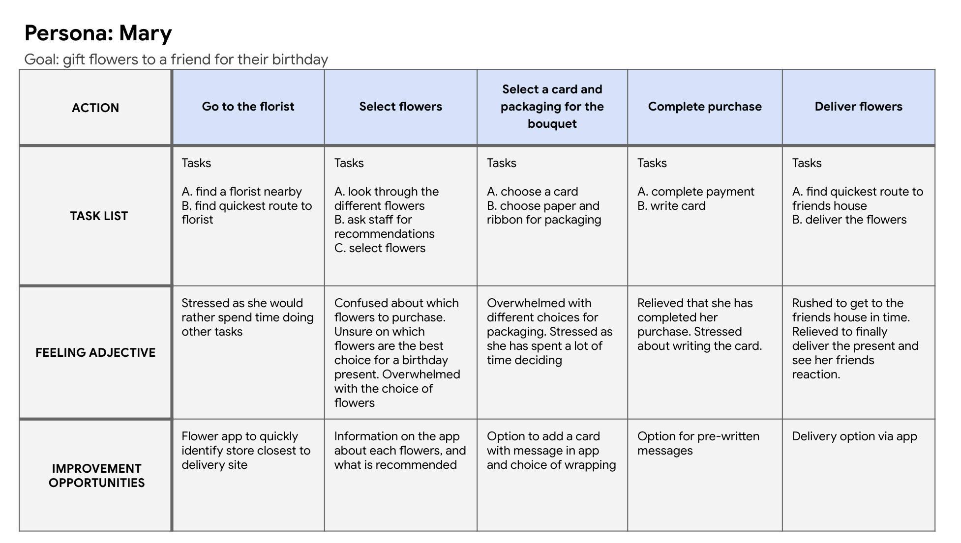
User Journey Map
Mapping Mary’s journey identified the importance of a dedicated app to order and deliver flowers
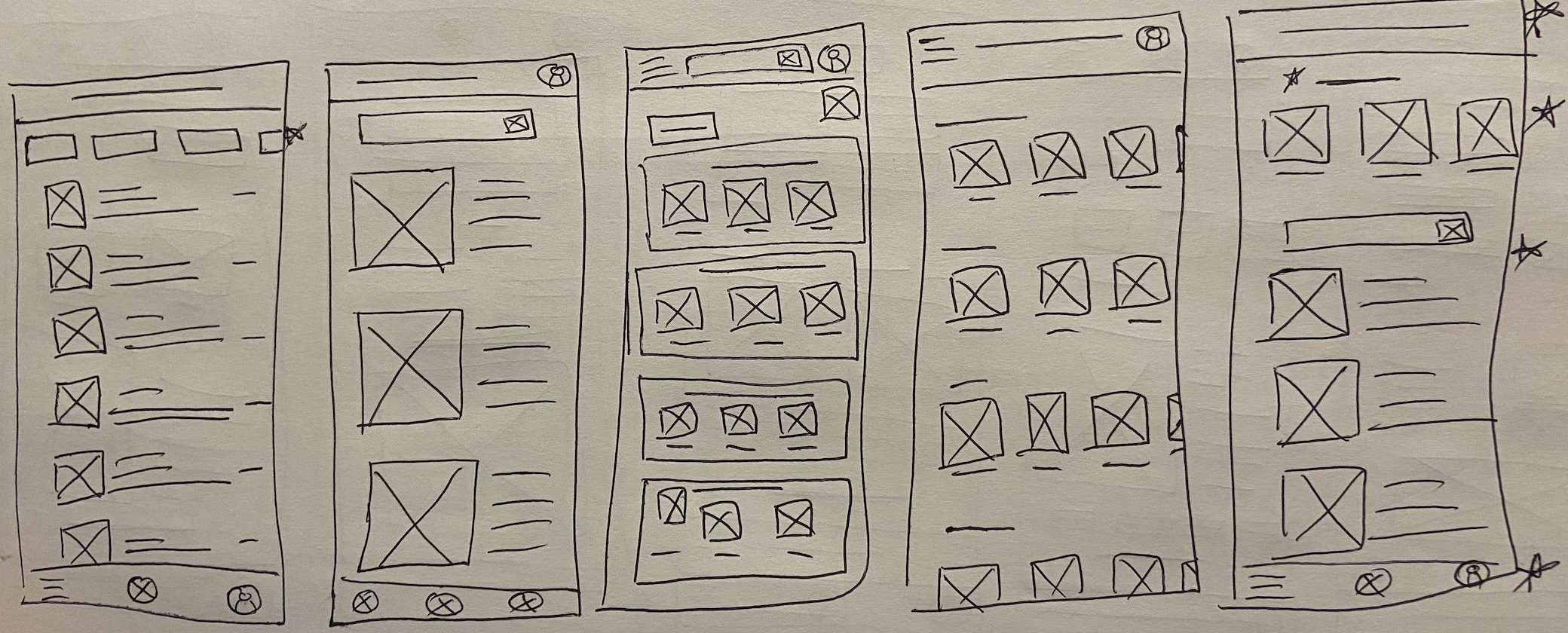
Starting The Design
Paper Wireframes
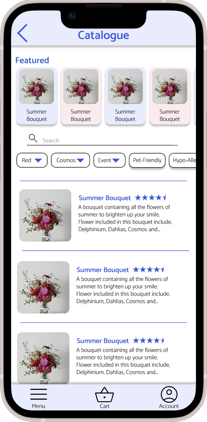
‘Flower Catalogue Page’ - I wanted to make a page that had options to choose features of the bouquets as well as having a ‘featured bouquets’ and search bar.
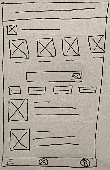
‘Flower Catalogue Page’ - Rapid Sketching
‘Flower Catalogue Page’ - Final
Digital Wireframes
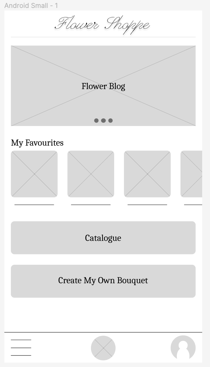
Homepage
Overall there is no mobile app for flower delivery services, so overall having a mobile application is beneficial to the user. The home screen also personalizes the experience for the user as most companies in the industry don’t provide a sign-up service.
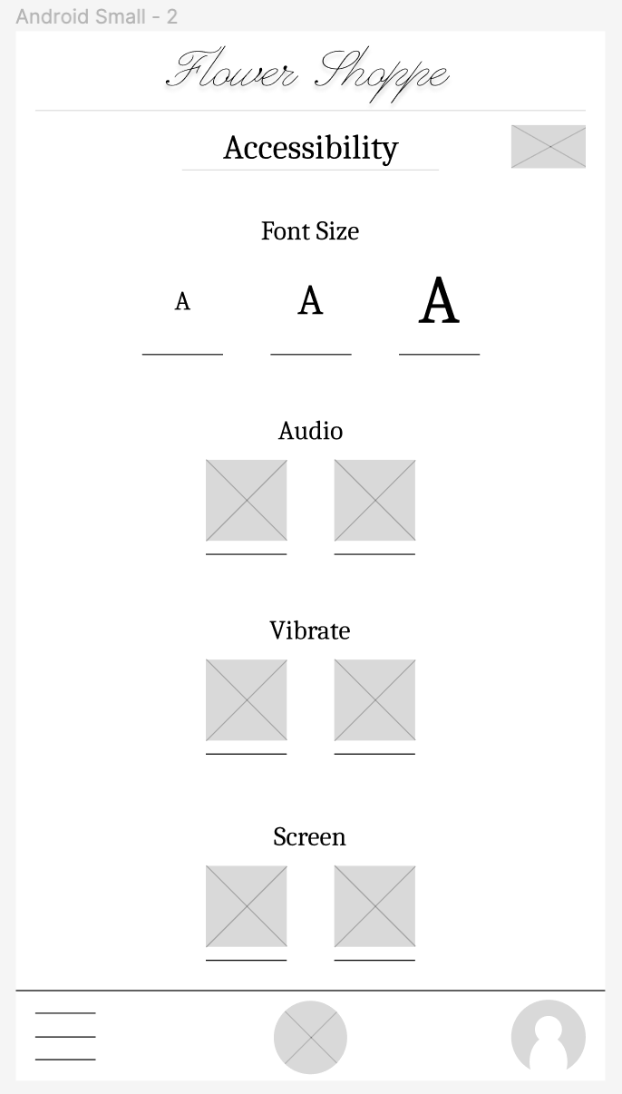
Accessibility Page
I designed an ‘Accessibility Page’ as I was unable to find a single website that provided settings to change edit the screen or actions to make it more accessible to people with impairments and for people who don’t speak English
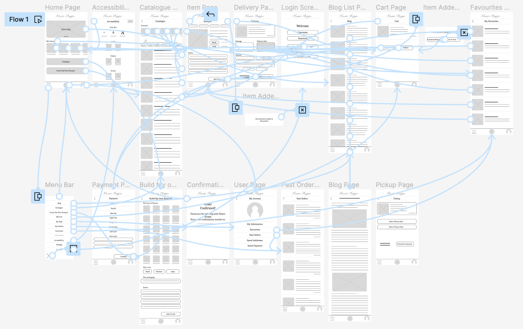
Low-Fidelity Prototype
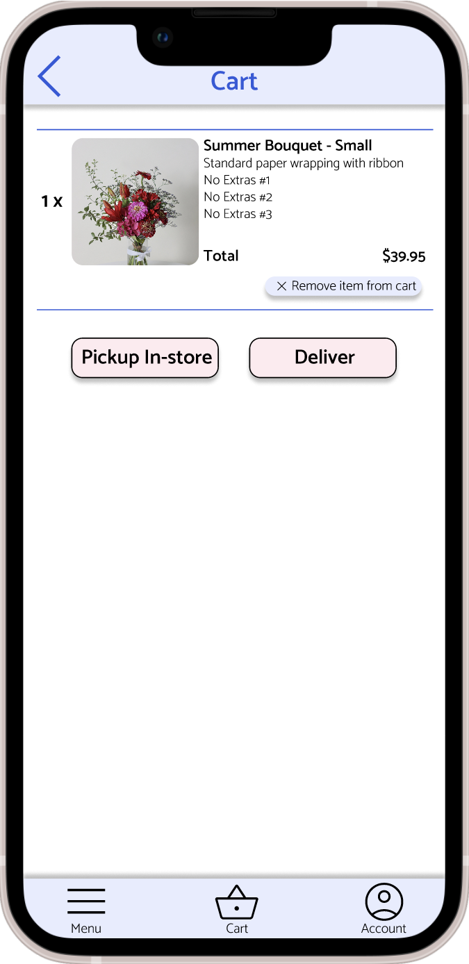
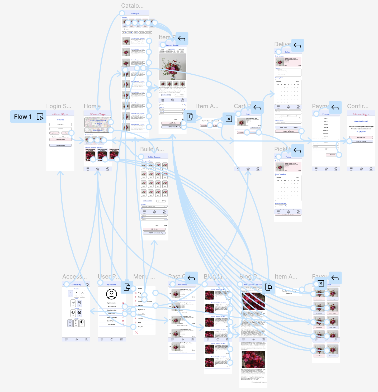
The low-fidelity prototype allows the user to go through the motions of ordering flowers and choosing either pickup or delivery for usability studies.
Usability Study: findings
I conducted two unmoderated usability studies using participants between the ages of 18 and 65 of all genders. Each participant was required to complete tasks and answer questions.
Round 1 Findings:
-
1
User wants to favourite created bouquets -
2
User wants a simpler home screen -
3
User wants larger buttons
Round 2 Findings:
-
1
Users couldn’t find the menu bar at the bottom of the page -
2
Users thought home screen was too busy - especially the blog section -
3
Users thought there should be higher contrast
Refining The Design
Mockups
Homepage
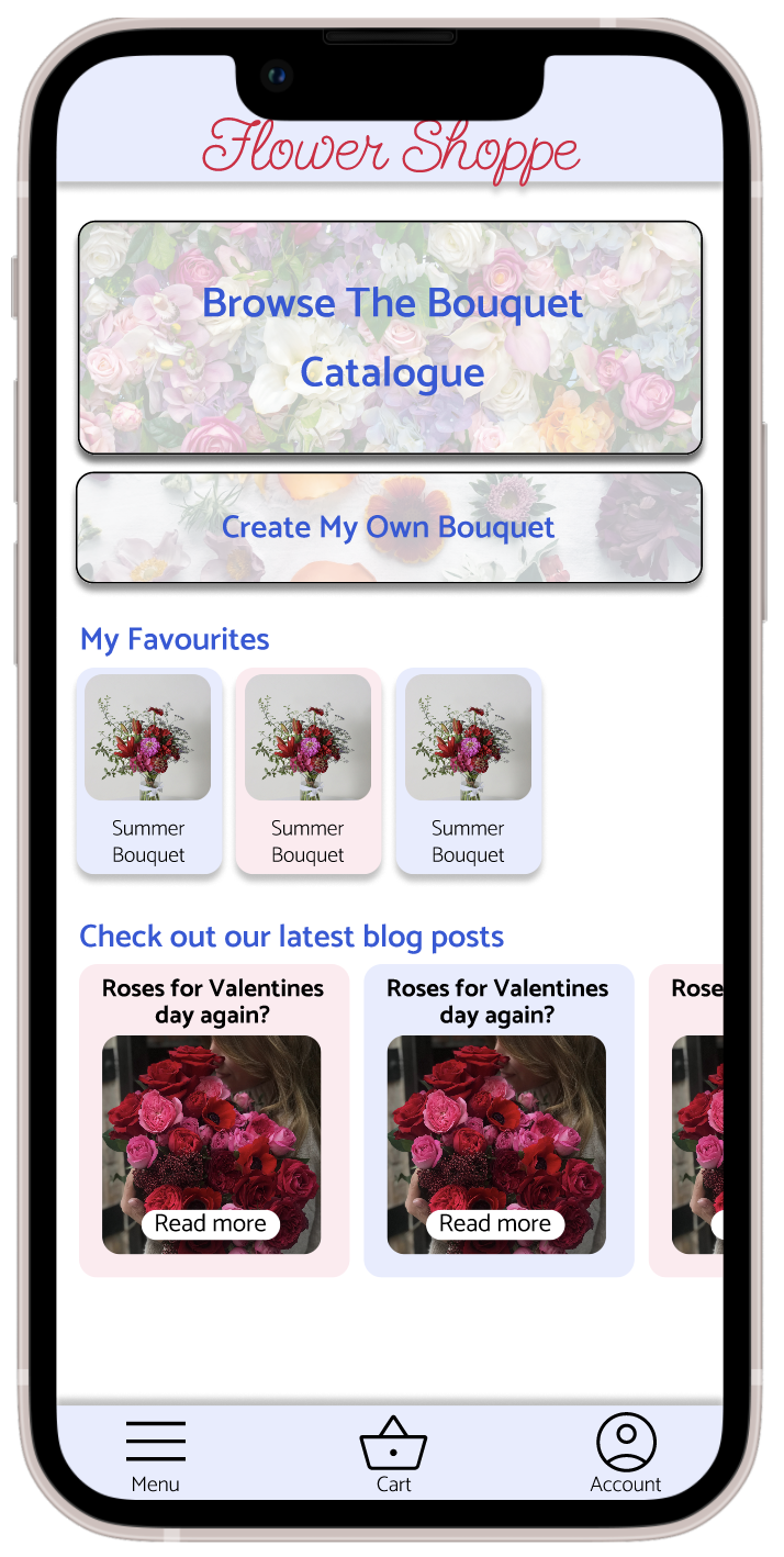
Early designs showed the blog at the top of the home page, with the ‘Catalogue’ and ‘Build A Bouquet’ buttons further down. These key buttons were moved to the top of the page, with the ‘Catalogue’ button being made larger with a bigger font so customers will see this button first.
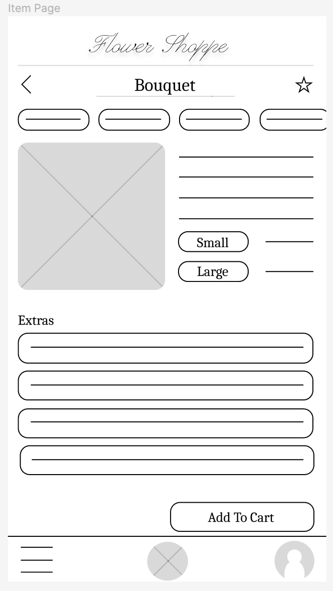
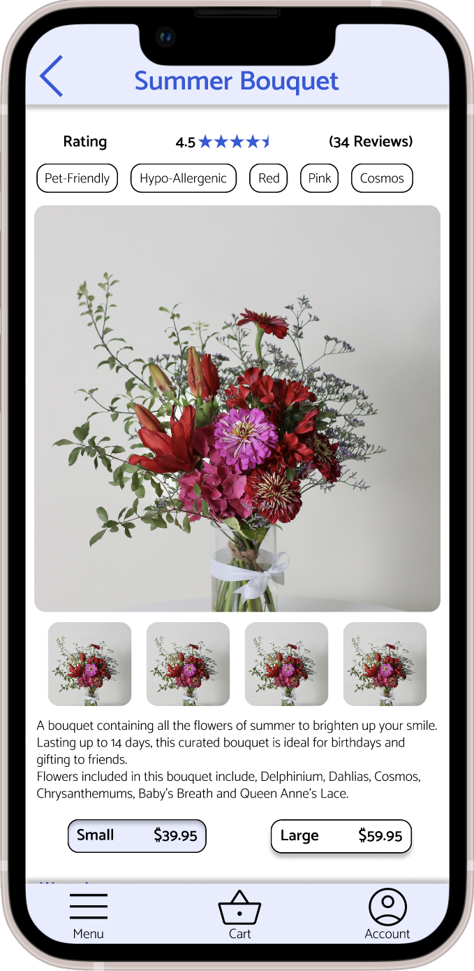
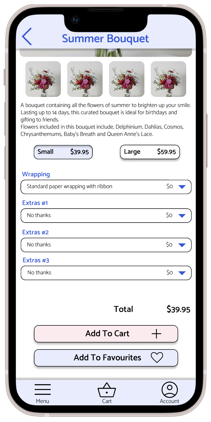
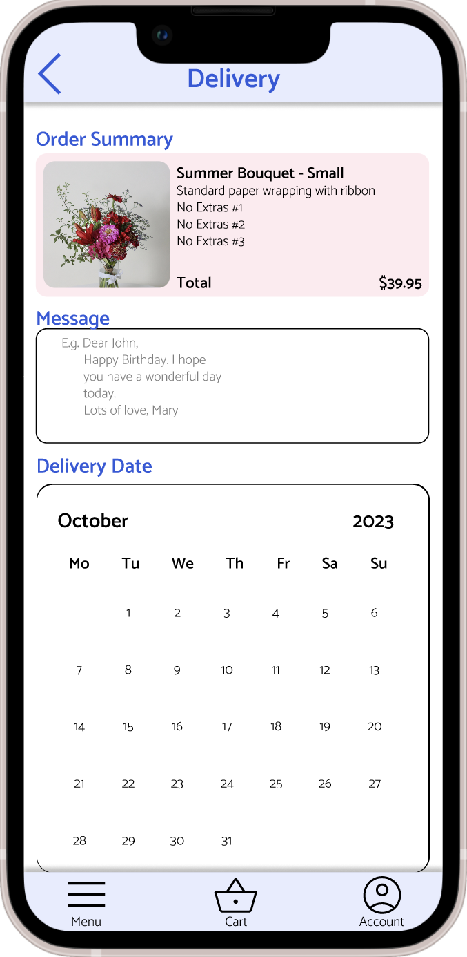
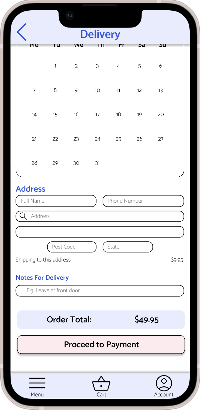
Bouquet Page
Originally the bouquet page was small with one picture, and you didn’t have to scroll. The page was made longer with more images and a ratings bar at the top as well as an ‘Add To Favourites button’ down the bottom. Furthermore the top and bottom menu and title bars were made to be kept on the top and bottom of the screen respectively while scrolling for easy access.
More Key Mockups
High-Fidelity Prototype
The final high-fidelity prototype includes more options and information for the user and has a more straightforward user flow.
Accessibility Considerations
-
1
An ‘Accessibility’ page was included for users to be able to set their desired font size, contrast, brightness, sound and vibration. -
2
The colours chosen for text have been tested and pass the WCAG AA standards, furthermore all key buttons have a black outline on the white background to enhance visibility. -
3
Icons as well as their respective texts have been included throughout to indicate the actions for certain buttons or to what page they will navigate to. -
4
The top and bottom bars were designed so they remained at the top and bottom of the screen respectively, allowing users easy access to the menu, cart, user page and back buttons.
Going Forward
Takeaways
Impact
The app allows personalisations for users and allows them to quickly complete orders with saved information, as well as being accessible. “I really like all the information you can save in your account, it makes it really easy to re-order flowers.” - Usability study participant
What I Learned
I learned that it’s highly important to think about accessibility throughout the whole process, to ensure all users have equitable access to the app and different features it provides. If accessibility isn’t considered, the app then becomes unusable for a portion of the population.
Next Steps
-
1
Conduct further usability studies to ensure pain points have been sufficiently met and no new pain points arise. -
2
Complete usability studies for the accessibility settings on the app.