Project Overview
The Product
‘HealthEat’ is a responsive website and mobile application that allows users to meal plan and also order ingredients in advance to save time and money while also being healthier and more sustainable.
Project Duration
October 2023 - November 2023
The Problem
Young adults find it difficult to organise meals in advance, and also find time to shop for ingredients while being money and health concious.
The Goal
Design a cross platform tool to help young adults learn how to cook healthier meals.
My Role
Lead UX Designer and UX Researcher of the HealthEat responsive website and mobile application from concept to delivery.
My Responsibilities
Conducting foundational research, empathizing with users, creating personas, designing paper and digital wireframes, creating low and high fidelity prototypes, conducting low and high-fidelity usability studies, developing mockups, creating a design system and iterating on designs with accessibility in mind.
Foundational Research
User Research
Summary
We conducted surveys with potential users about their current
lifestyles and how that affects the way they eat, as well as their
thoughts on the nutritional values of their meals and how this could
be improved.
Survey results revealed a range of pain points
prospective users were currently facing in their current lifestyle.
Target Participant Characteristics
-
Ages 18-35
-
Lives in metro and regional areas by themselves or with others
Include participants of both genders
Include participants with disabilities
Survey Questions
-
Please describe your current schedule and how you incorporate meal planning and preparation into it.
How often do you cook home-made meals in a week?
-
How many days a week do you think you eat the required amount of fruit and vegetables?
-
Do you believe you are eating enough healthy meals throughout the week? Why or why not?
-
How do you think you could be eating healthier meals throughout the week?
Initial user interviews and empathy maps
Pain Points
-
1
Time
Users often don’t have enough time to research, purchase ingredients, and then cook nutritional meals. -
2
Disorganization
Often users will not have organized what they plan to cook in advance and will just cook something easy that is usually not nutritious. -
3
Effort
After working all day, users will often not want to put effort into cooking a meal, resulting in something quick such as a pre-made meal, or takeaway. -
4
Knowledge
Many users are not fully aware of the nutritional values of meals they are consuming, and there are still a few that are not sure what a nutritious meal should consist of.
Competitive Audit
Personas
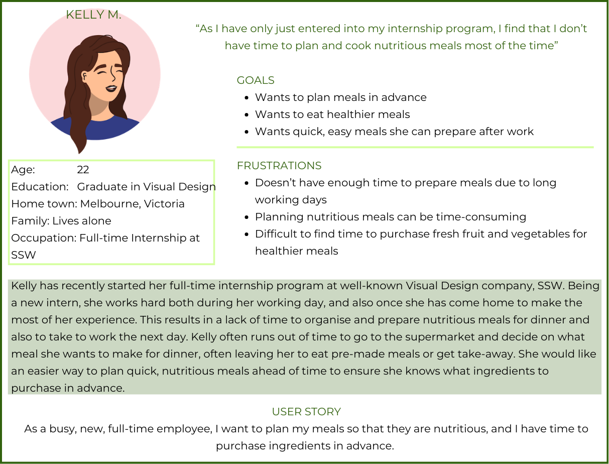
User Journey Maps
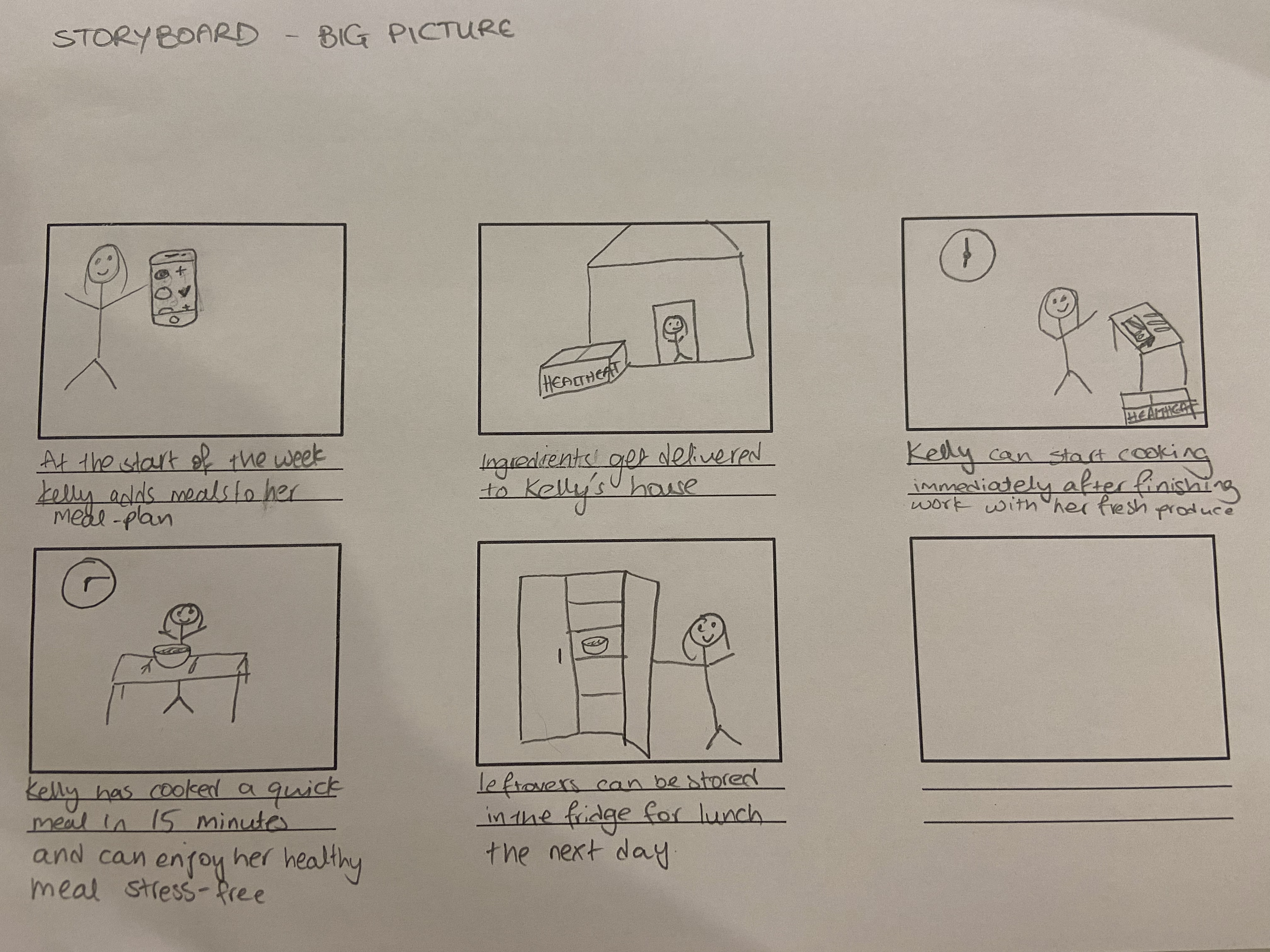
Mapping Kellys journey allowed us to identify steps to benefit the user in the creation of HealthEat
Action
Decide on meals
Purchase ingredients
Cook meal
Task list
Look up recipes
-
Ensure recipes have sufficient nutrients and are quick to make
Select up to 3 recipes for the next few days
Find time to go to the supermarket
Purchase the correct ingredients
Allot some time to cook meal
Follow recipe and cook meal
Enjoy meal
Feeling
-
Overwhelmed and stressed that they have to ensure every recipe they look up contains sufficient nutrients
-
Tired as they have spent all day working and don’t want to spend time at the supermarket
-
Frantic as they are rushing to make a meal in limited time
-
Happy when they are able to create a good healthy meal
Improvement opportunities
-
A quicker and easier way to look up quick, nutritious, balanced meals.
A way to order ingredients to users house
Problem Statement
Kelly is a busy intern who needs a way to plan quick, healthy meals so she can purchase ingredients in advance.
Hypothesis Statement
If Kelly uses ‘HealthEat’, then she will be able to plan meals from a selection of recipes and order the required ingredients in advance.
Goal Statement
Our mobile app/responsive website will let users plan nutritious
meals which will affect busy young adults ensuring they have healthy
home cooked meals throughout the week despite lack of time.
We
will measure effectiveness by analyzing how many users use the
planing feature of the app/website.
Starting The Design
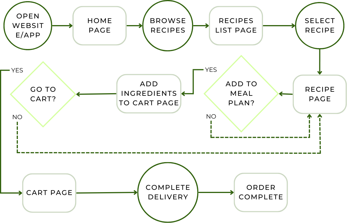
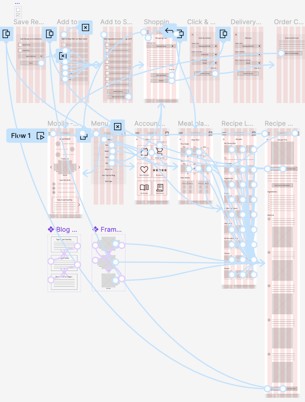
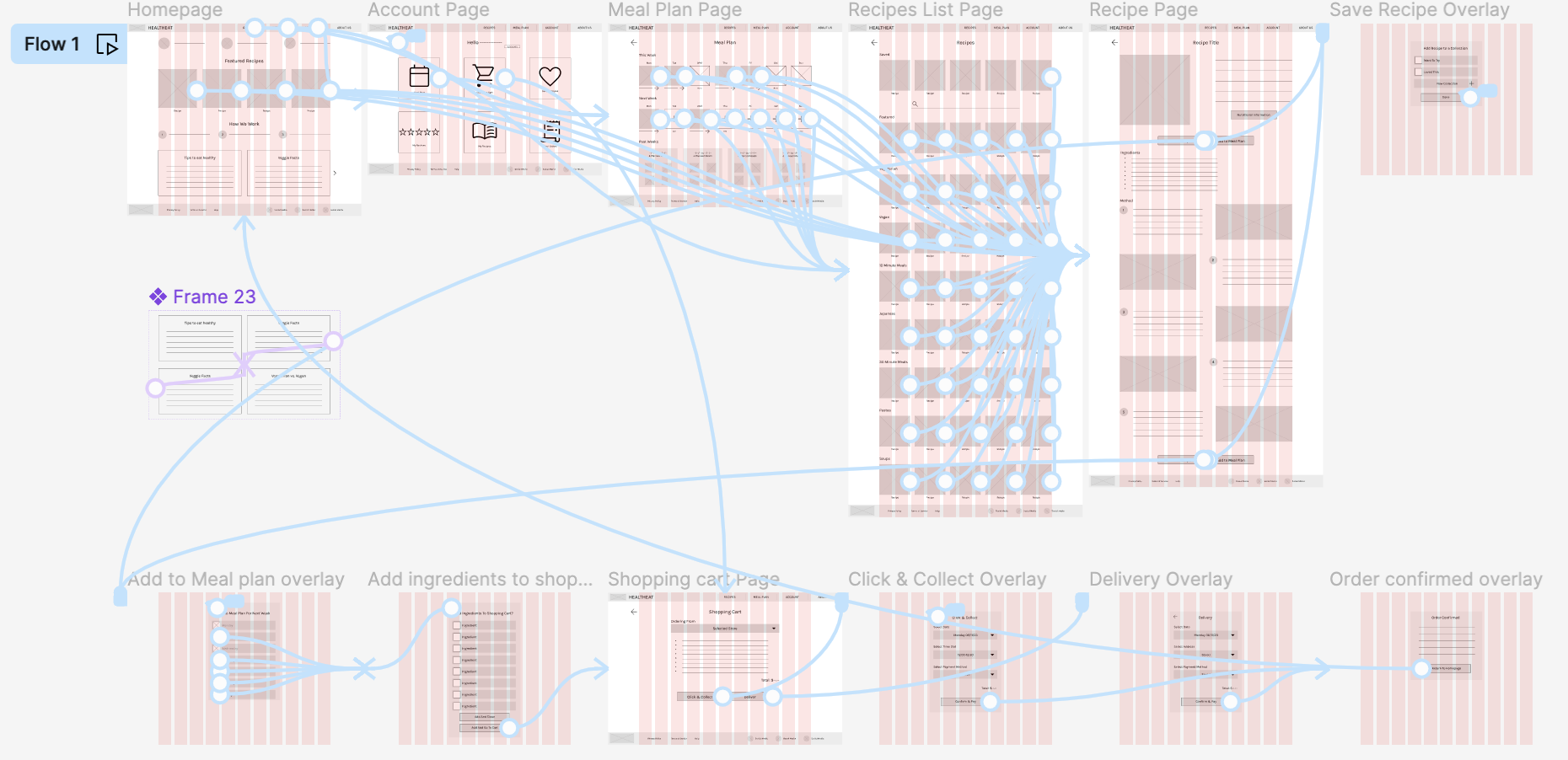
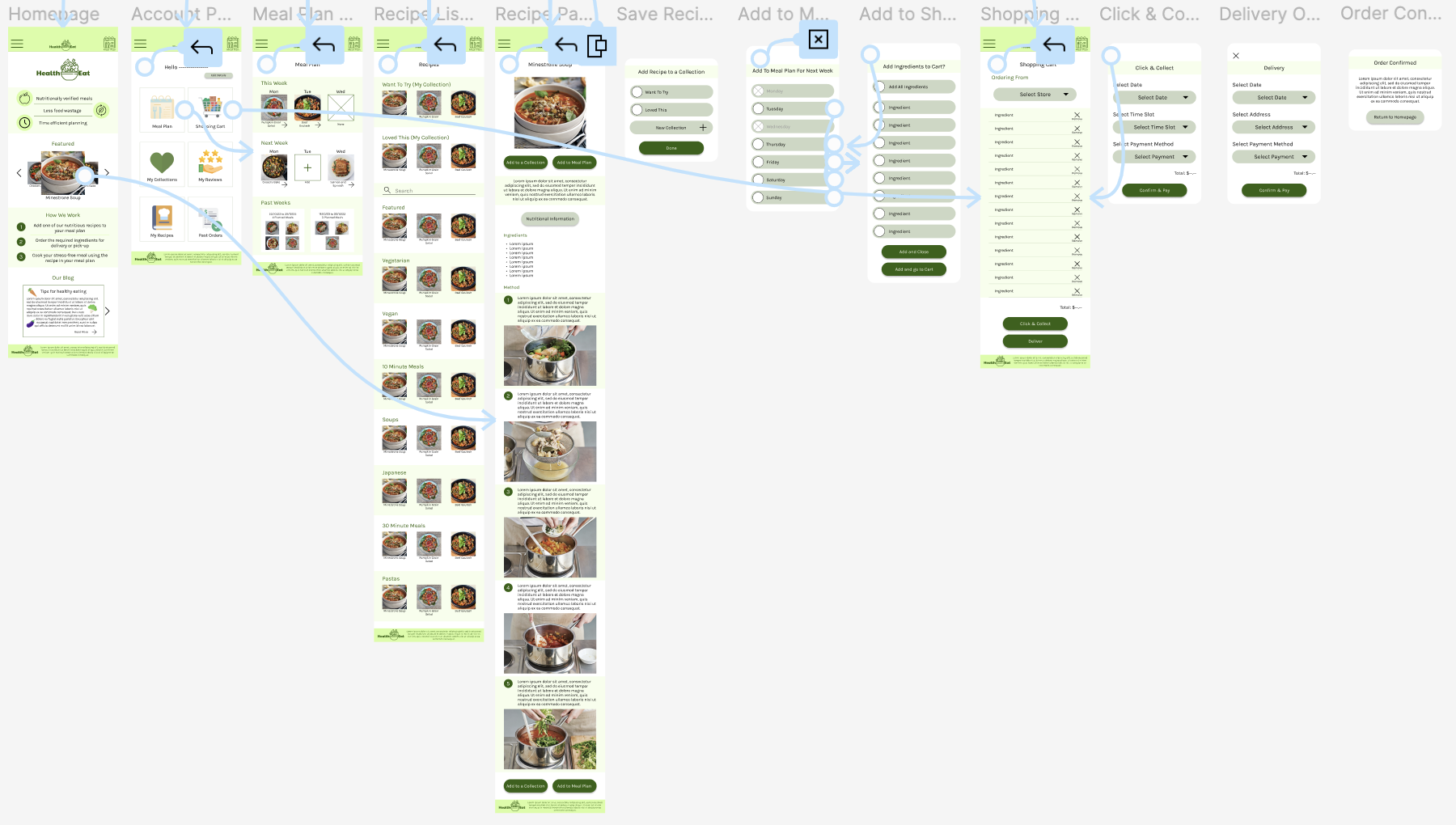
User Flow
The user flow diagram depicts the steps users go through to complete the key task of the website.
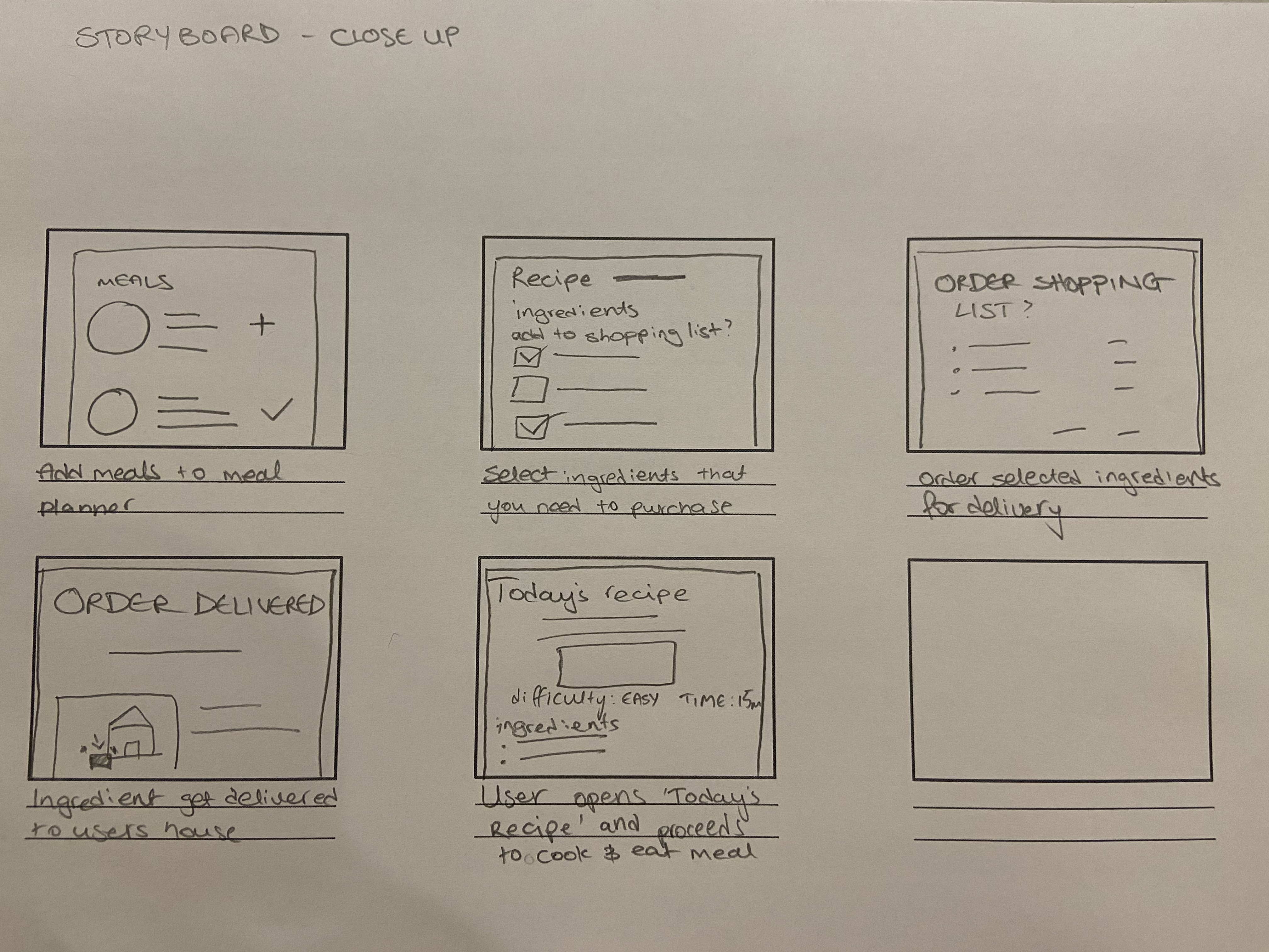
Storyboards
Close-up
Big-Picture
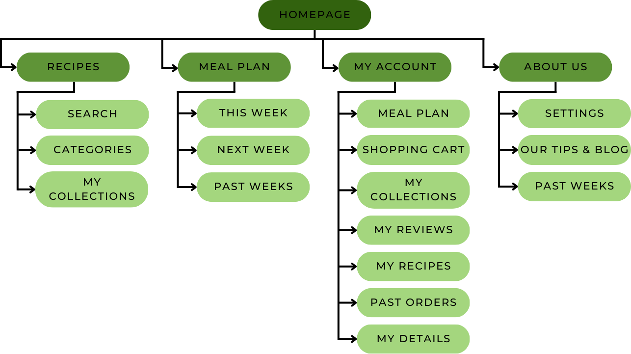
Sitemap
Paper Wireframes
To start the design of my website, I decided to start designing the mobile-website first, then translate my design to a desktop-website. This decision was made as ‘HealthEat’ key users are young adults, most of which use smart phones rather than computers to complete everyday task, and also keeping the Next Billion Users in mind.
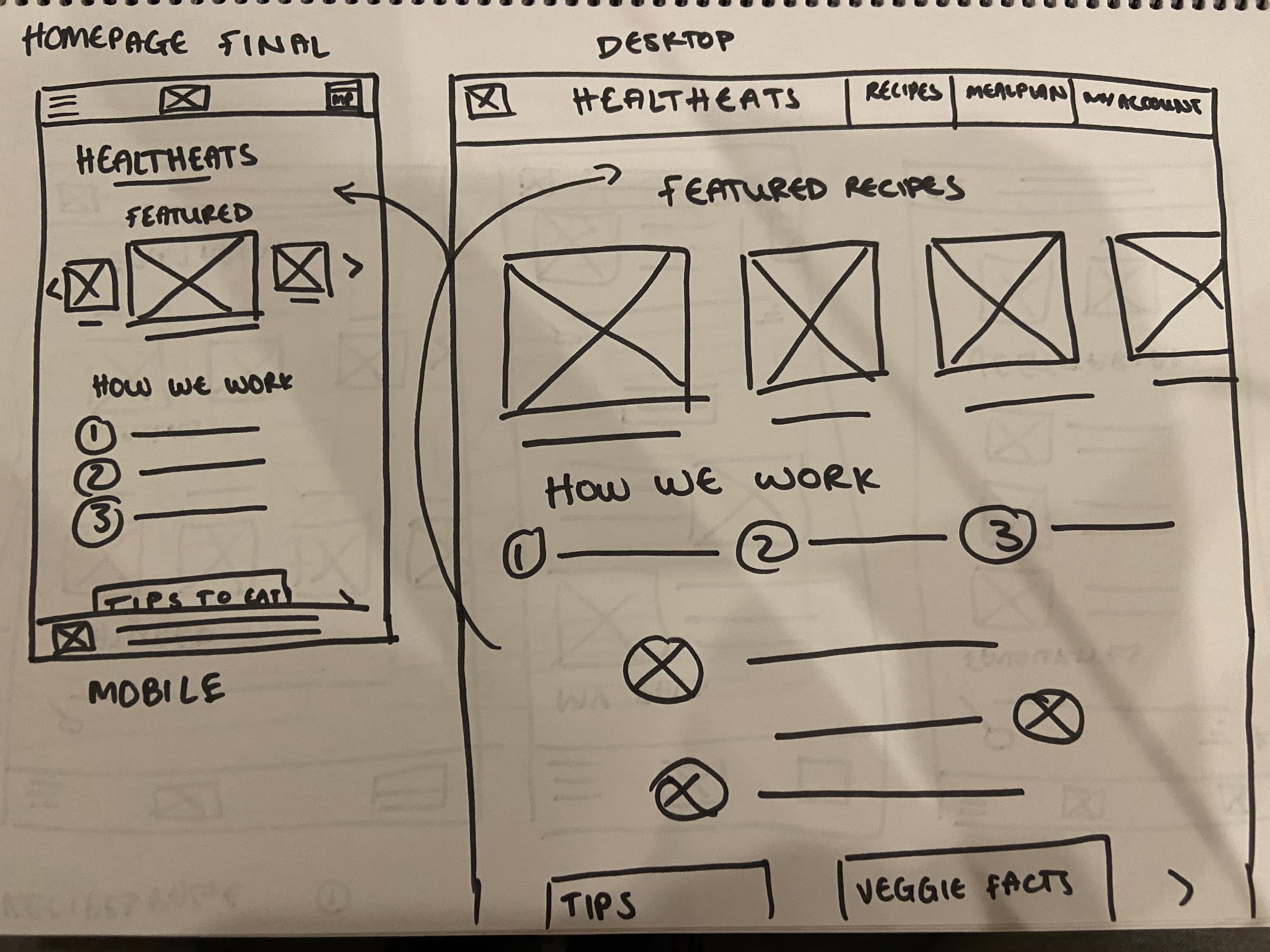
‘Homepage’ - Rapid Sketching
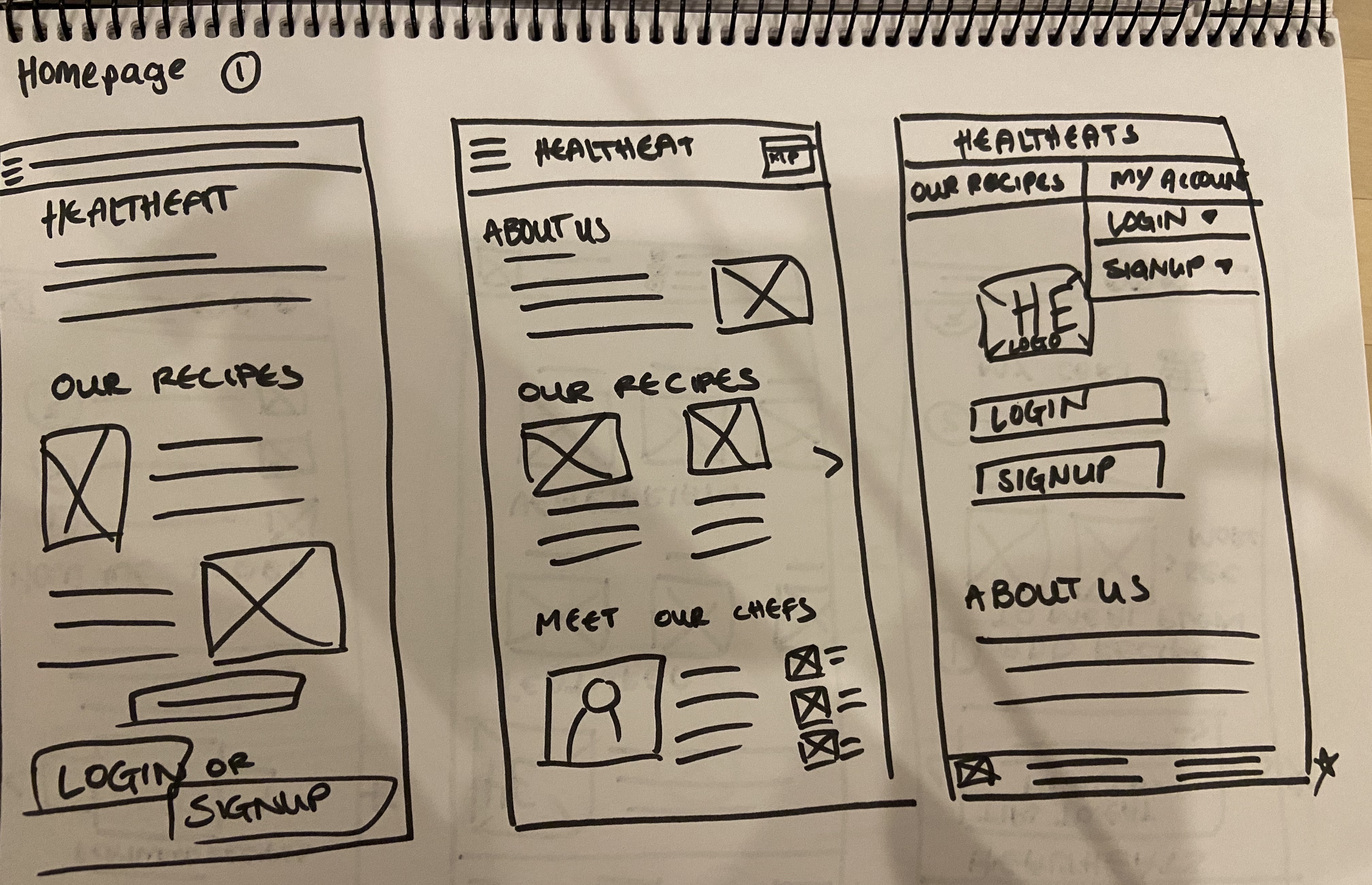
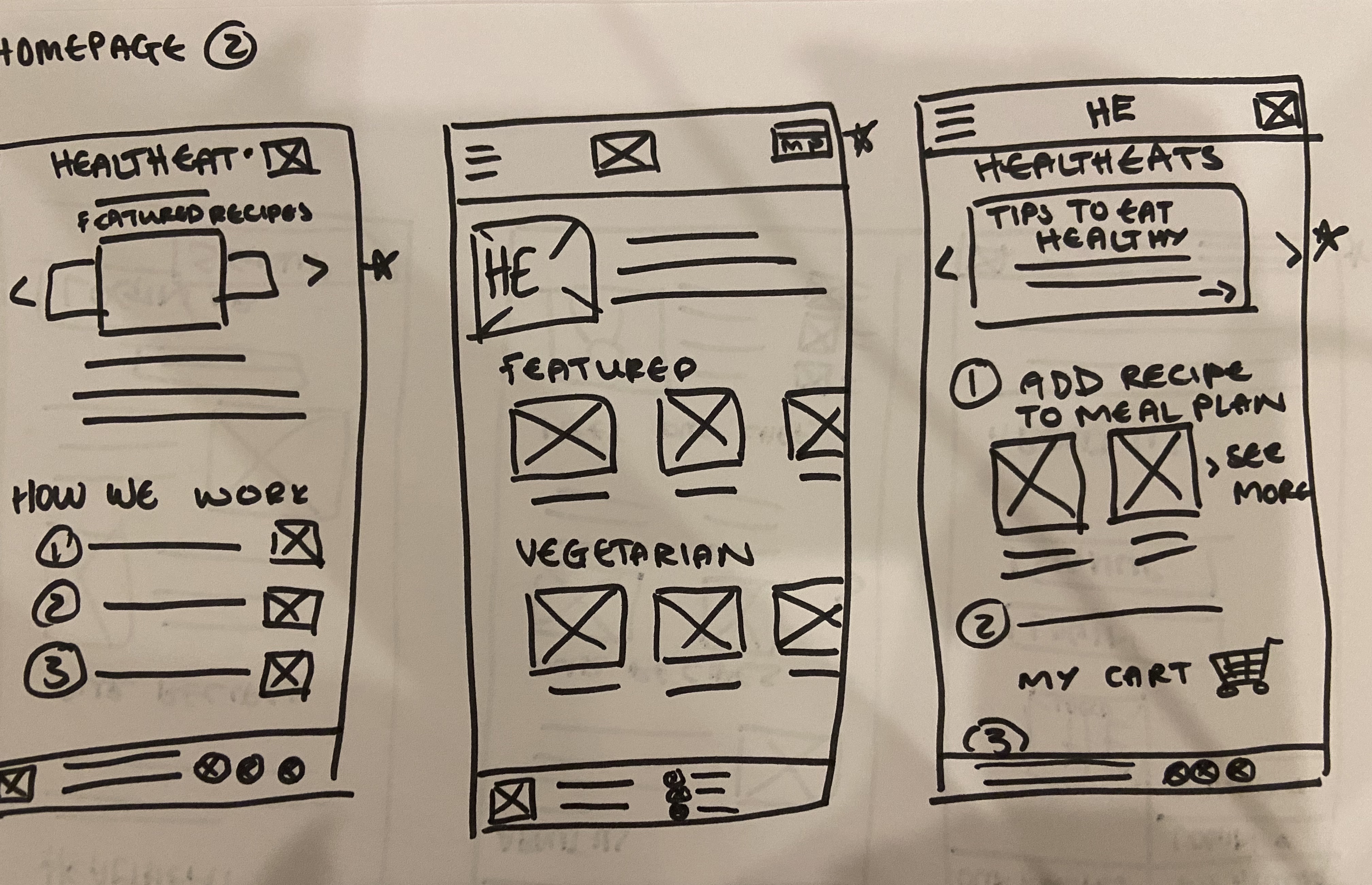
‘Homepage’ - Final
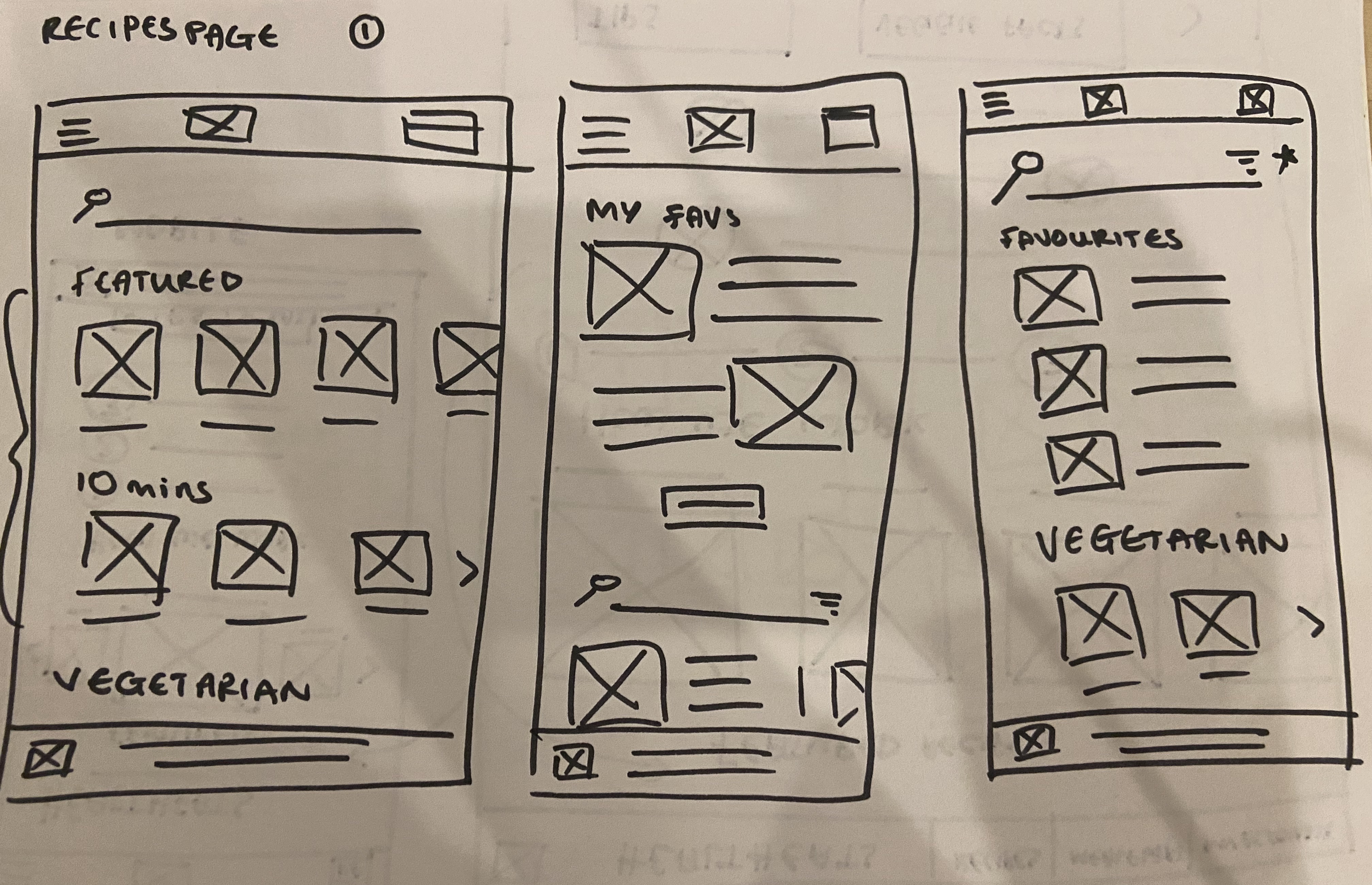
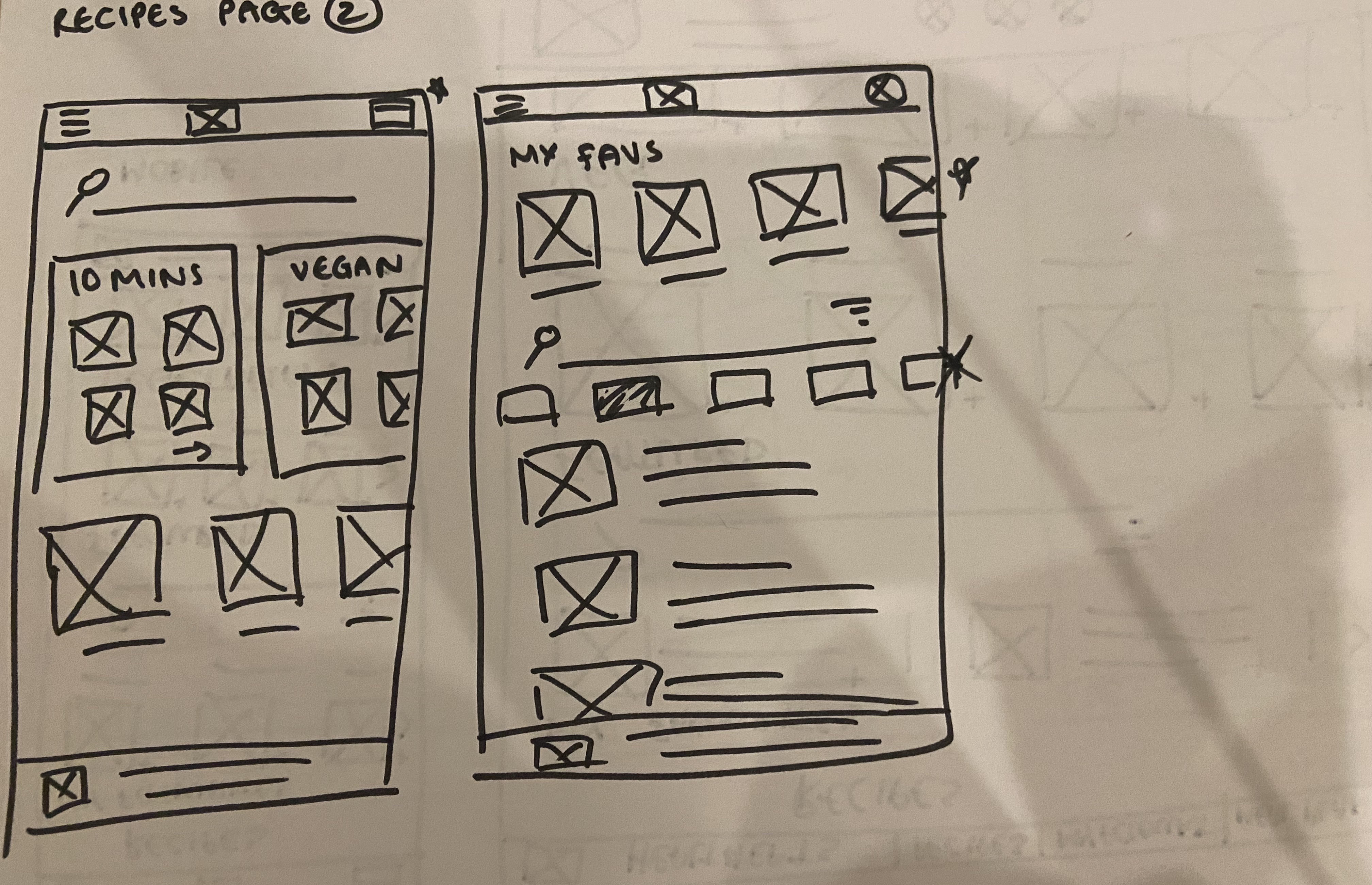
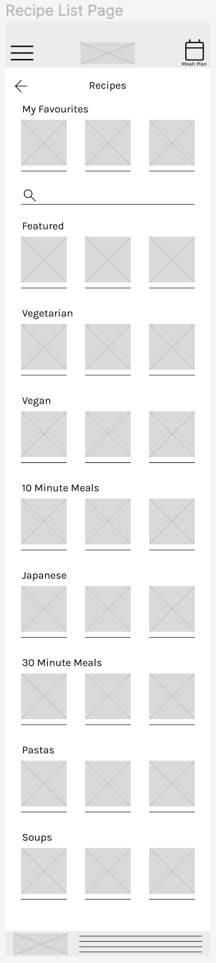
'Recipes Page' - Rapid Sketching
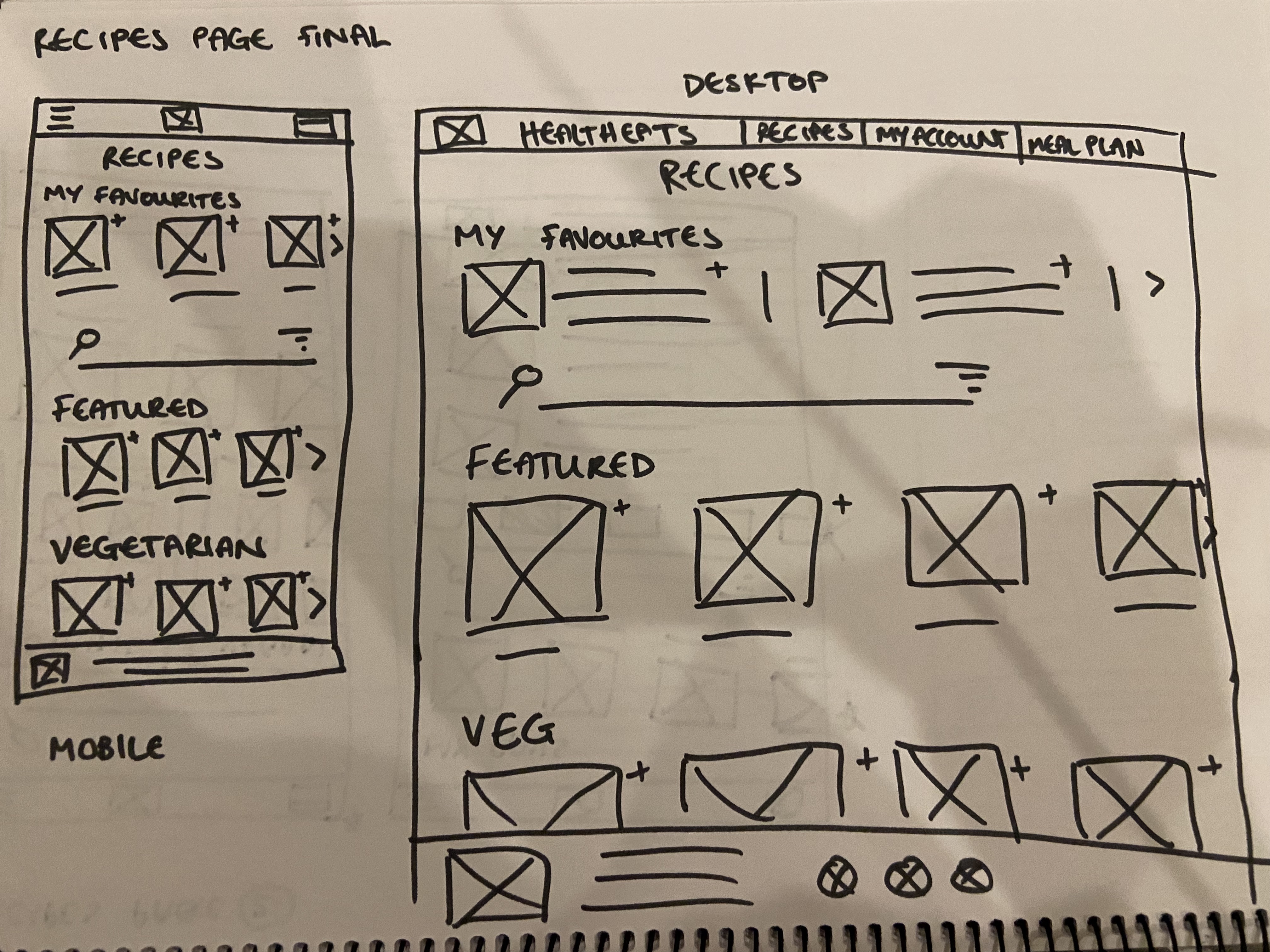
'Recipes Page' - Final
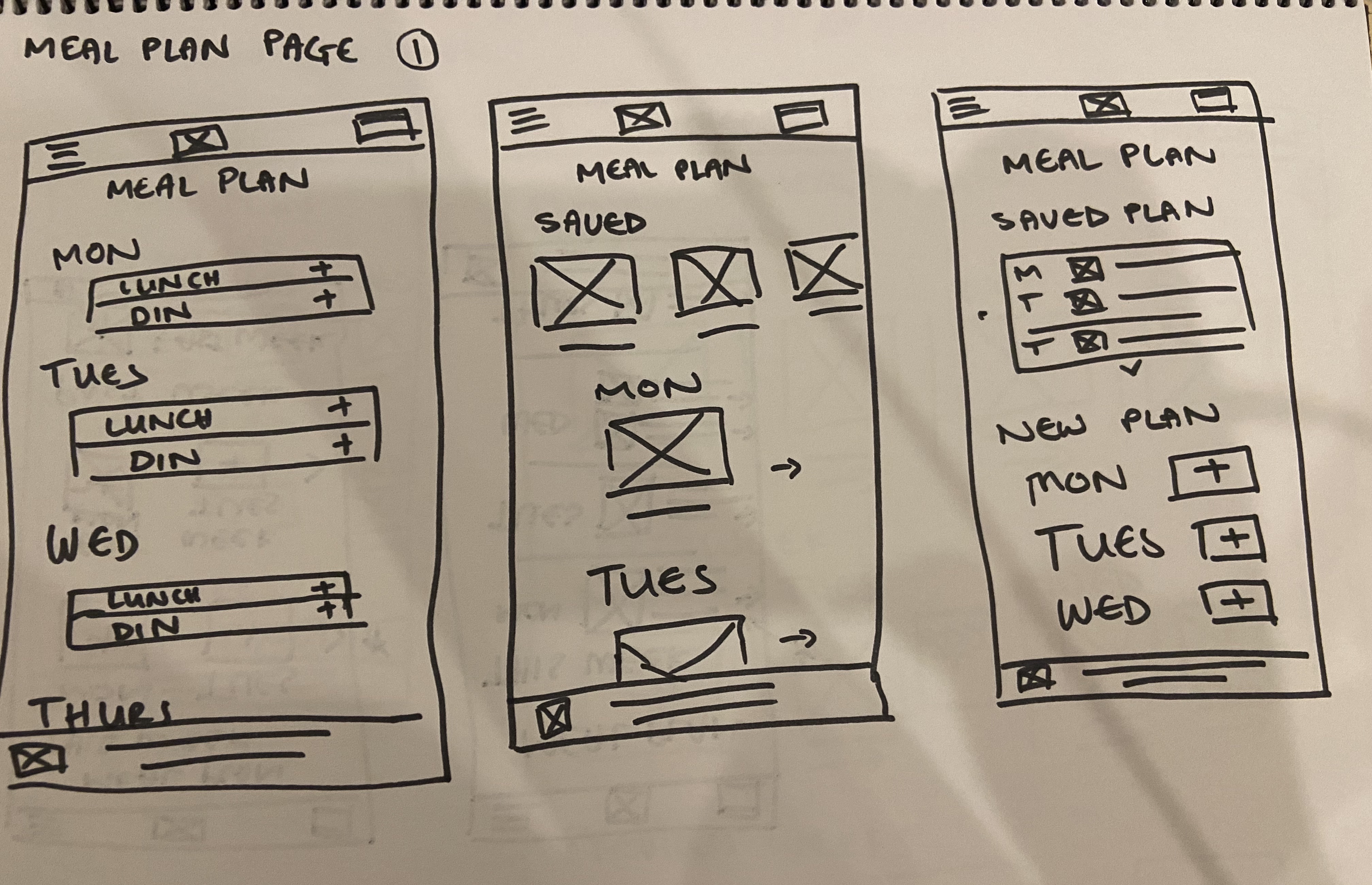
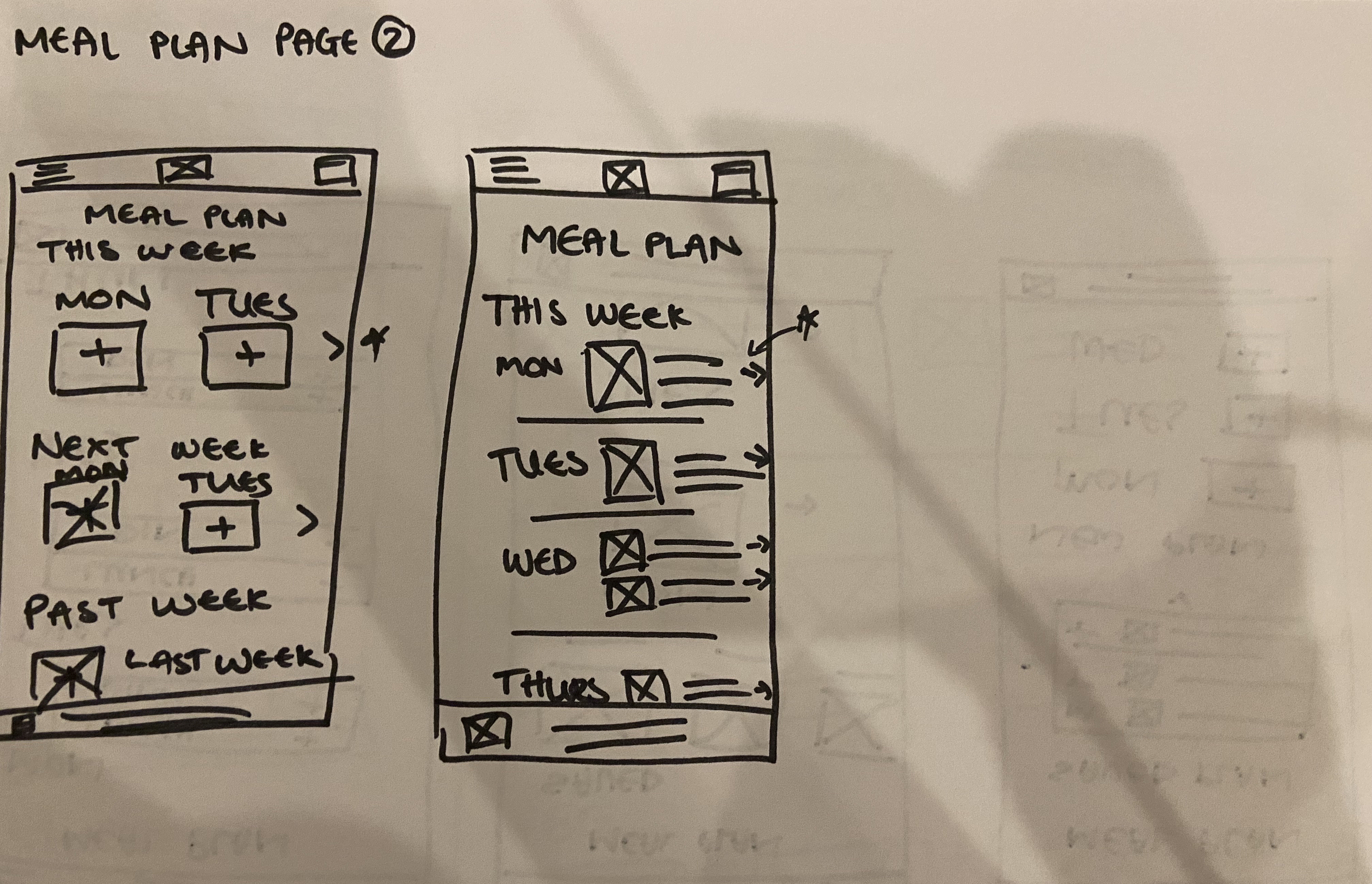
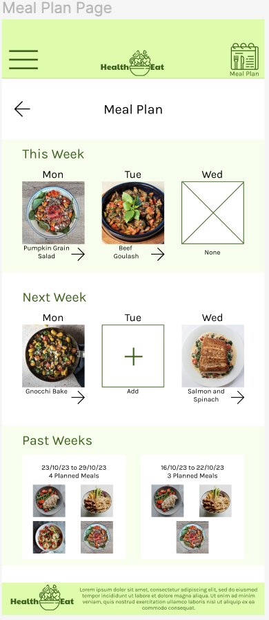
'Meal Plan Page' - Rapid Sketching
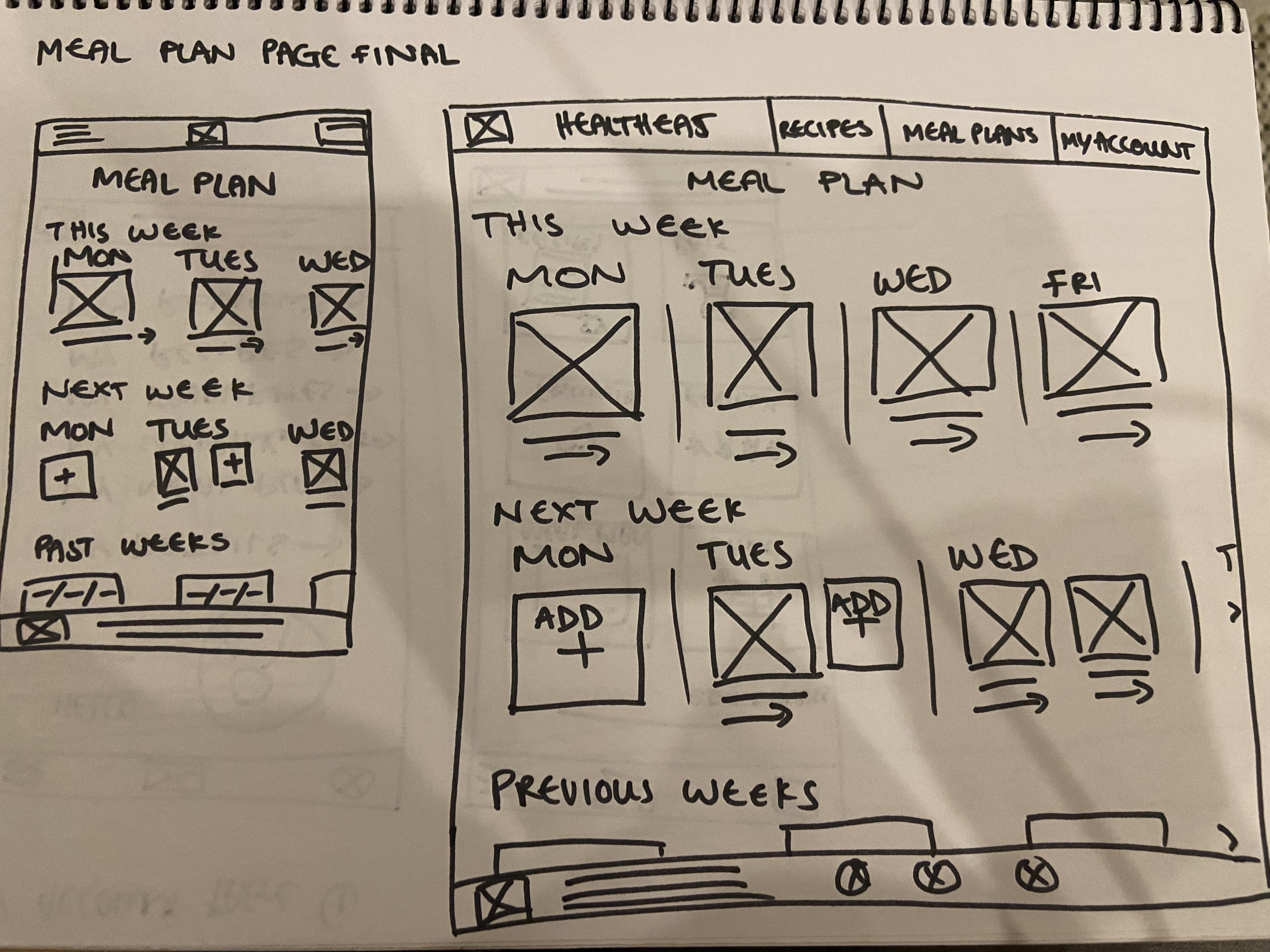
'Meal Plan Page' - Final
Digital Wireframes
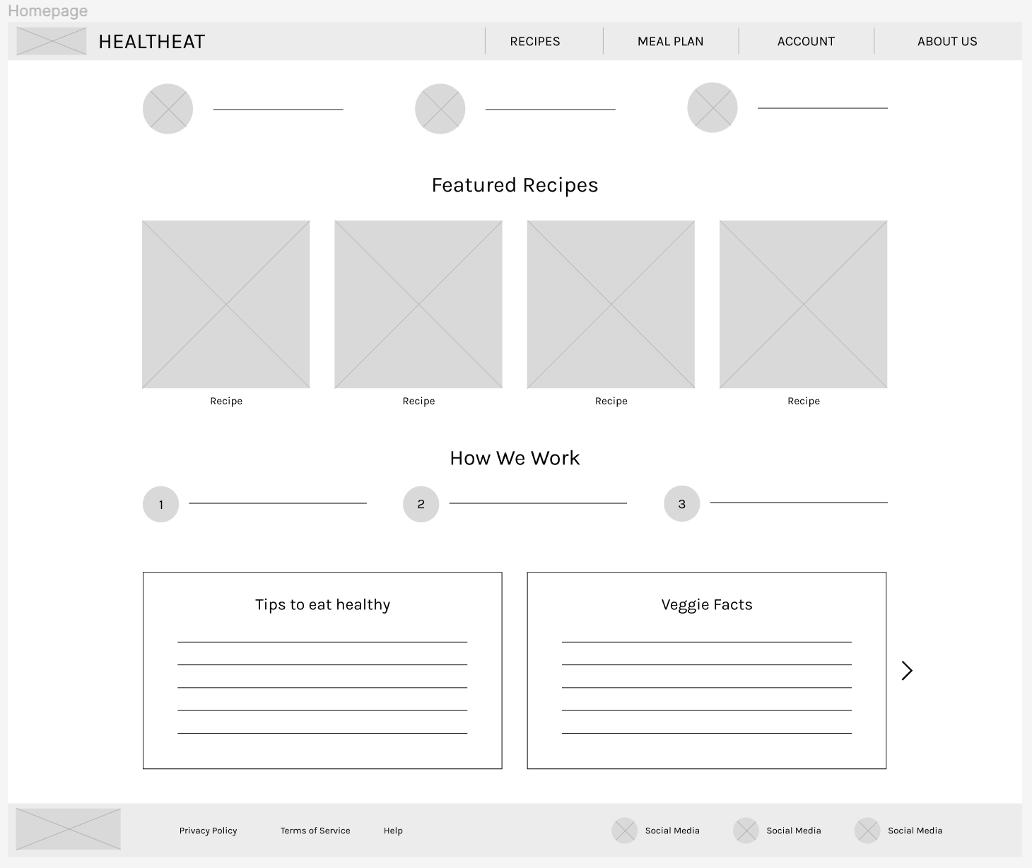
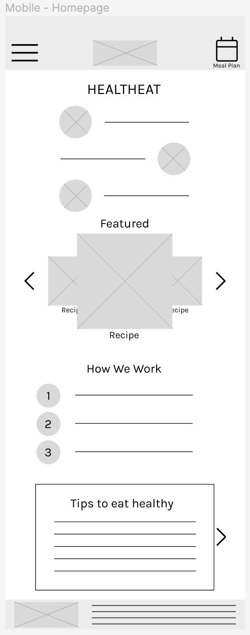
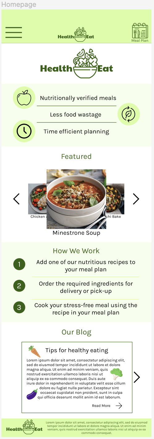
Homepage
The mobile website homepage is designed to be simple and to let users know about the main features of the website. Following similar designs as meal planning apps, i have included 3 lines to state the benefits of using this app, then included a carousel of featured recipes. I also included ‘how we work’ steps to ensure users understand how to effectively use the website. I have also included a blog scroller below the fold as reading these posts is not what we want the user to notice first and foremost.
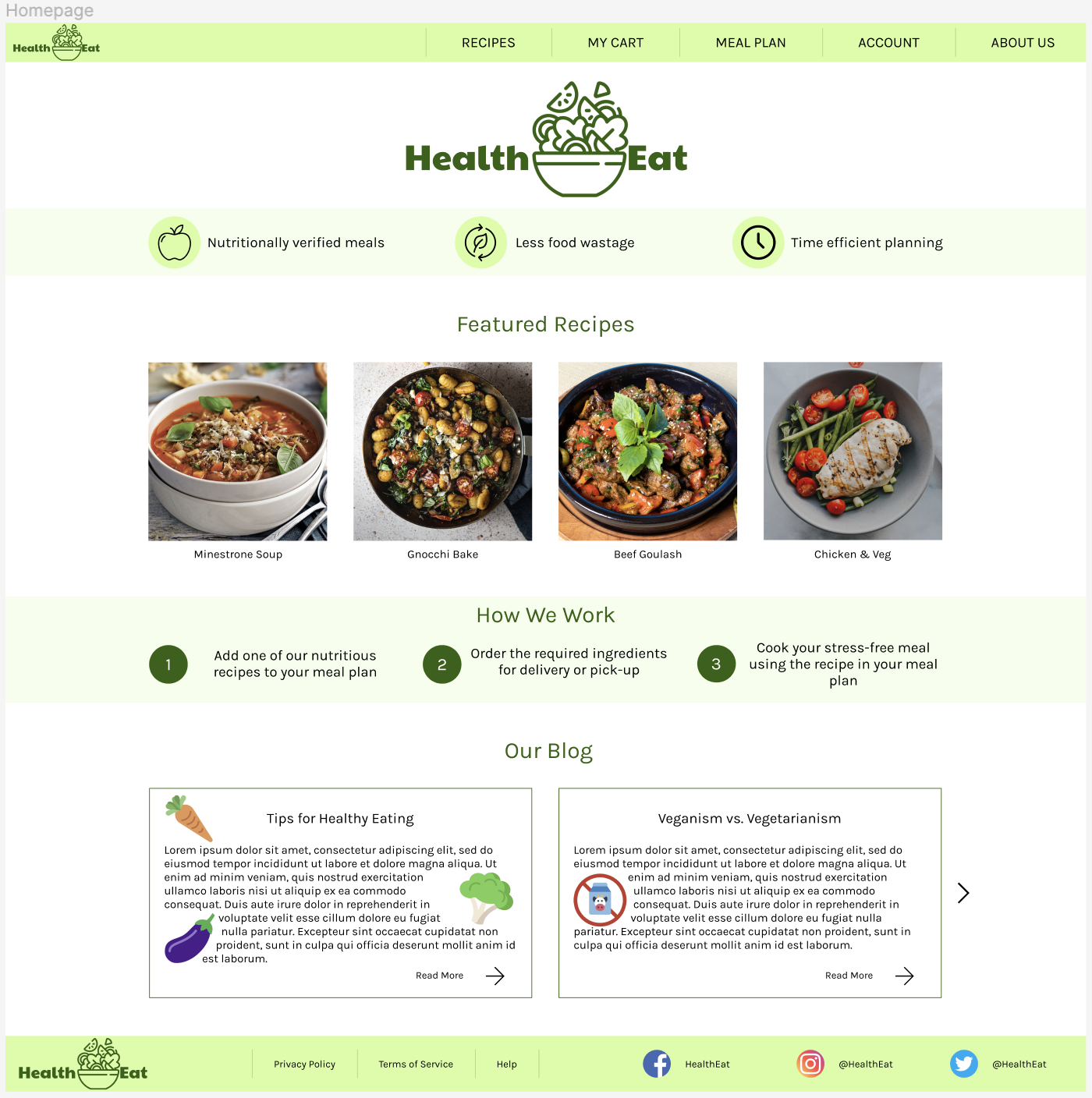
Homepage (Screen Size Variation - Desktop)
The layout of the desktop website’s homepage is very similar to the mobile websites homepage and consists of the same 4 elements, although more spread out.
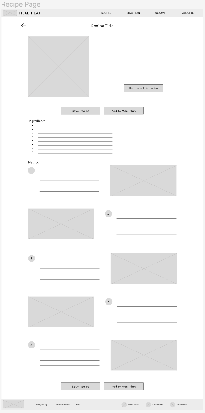
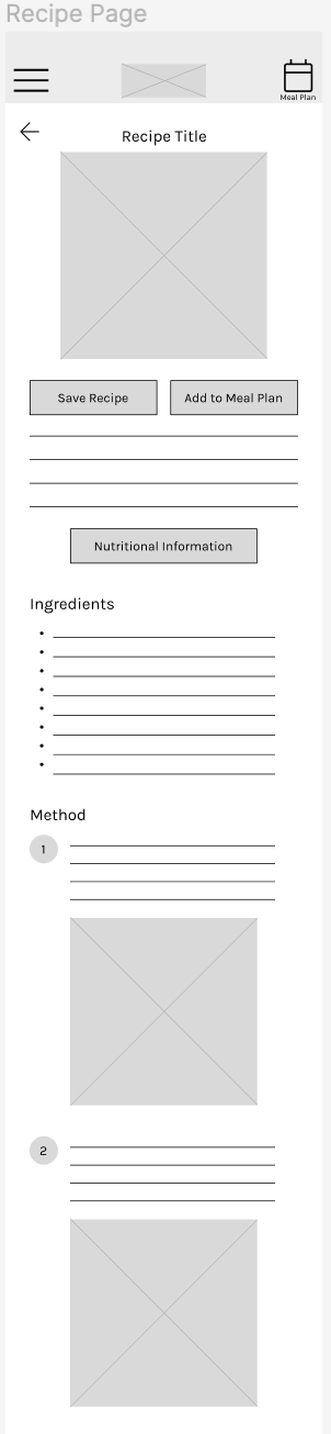
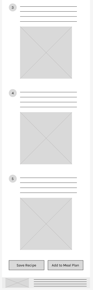
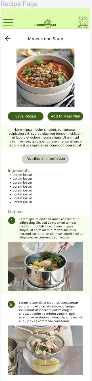
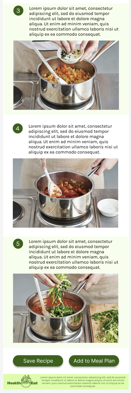
Recipe Page
The layout of the recipe page was organised so that users first see the recipe title and an image of it with a ‘save recipe’ and ‘add to meal plan’ button directly below, indicating the main actions for the user. Below these buttons is a short description of the recipe as well as a ‘nutritional information’ button. Next, the actual contents of the recipe are included with the ‘ingredients’ then the ‘method’. At the bottom of the page the ‘save recipe’ and ‘add to meal plan’ buttons are placed again so users don’t have to scroll back to the top to press these buttons.
Recipe Page (Screen Size Variation - Desktop)
The recipe page on the desktop version has the main image of the recipe with the short description next to it, as well as the nutritional information button. The method is designed to have alternating steps and their respective images in order for users to not get confused between steps, and can easily find where they are in the recipe.
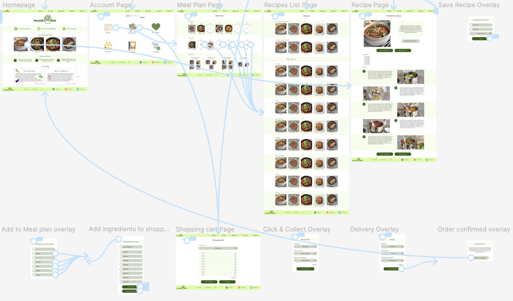
Low-Fidelity Prototype
The low-fi prototype allows users to go through the processes of searching through recipes, adding recipes to a meal plan, and ordering the required ingredients for delivery or click and collect.
Usability Studies
Usability Study One (Low-Fidelity Testing)
Research Study Plan One
Unmoderated, remote usability study of 5 participants completing tasks through both the mobile and desktop website low-fidelity prototypes and responding to questions.
Research Goals
-
Determine whether users can successfully add a recipe to their meal plan.
-
Determine whether users can successfully order items for click & collect or delivery.
Study One Findings
-
Priority 0
-
Some users had trouble finding the cart button on desktop
-
-
Priority 1
-
Few users thought that an ‘add all ingredients’ button should be added to the add ingredients to cart page
-
Few users had trouble finding the cart button on the mobile website
-
-
Priority 2
-
Few users thought it might be better to see the whole week of meal plans on the website
-
Usability Study Two (High-Fidelity Testing)
Research Study Plan Two
Unmoderated, remote usability study of 4 participants completing tasks and answering questions while free-flowing through both the mobile and desktop website High-fidelity prototypes.
Research Goals
-
Determine whether users can easily understand prompts to order delivery.
-
Determine the usability of the website and if any other features or steps are needed.
Study Two Findings
-
Priority 0
-
Most users wanted a fully clickable dropdown bar
-
-
Priority 1
-
Few users wanted to add/remove all ingredients from cart
-
Few users were confused about the saving recipe feature
-
-
Priority 2
-
Few users wanted to add recipes to this week’s meal plan
-
Few users were unsure about the layout of the past weeks images when more than 4 meals were inserted
-
Few users wanted to add ingredients to their cart without adding the recipe to the meal plan
-
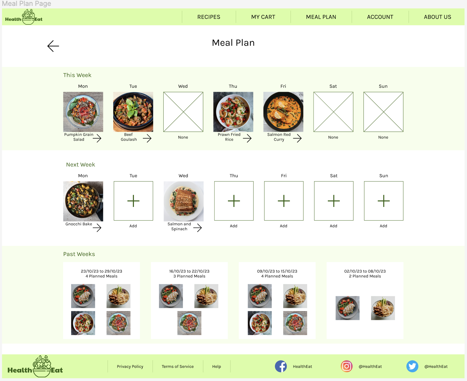
Few users thought the weekday names on the meal plan didn’t stand out enough
-
Refining The Design
Final Designs
Homepage
For the mockup designs, the main colours I incorporated into the
design is different shades of green, as it is associated with the
environment and health. For the homepage I included 3 icons to aid
in describing the 3 benefits of using ‘HealthEat’. I also used a
very light shade of green to create containment of sections so
that users can move between each section easily.
On the desktop version of the website, following recommendations
from user testing, a ‘my cart’ button has been added into the
navigation bar so that users have easy access to complete one of
the main purposes of the website.
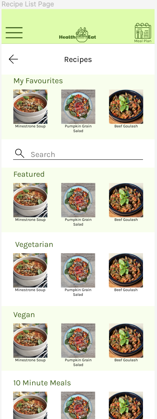
Recipe Page & Recipes List Page
Throughout the website, the main call to action buttons had been
changed to a background of dark green and a font of white with a
shadow in order to be the most obvious to users so they know which
buttons they need to press. Less important buttons were changed to
a lighter variant of the dark green with black text so that they
wouldn’t be as obvious on the page.
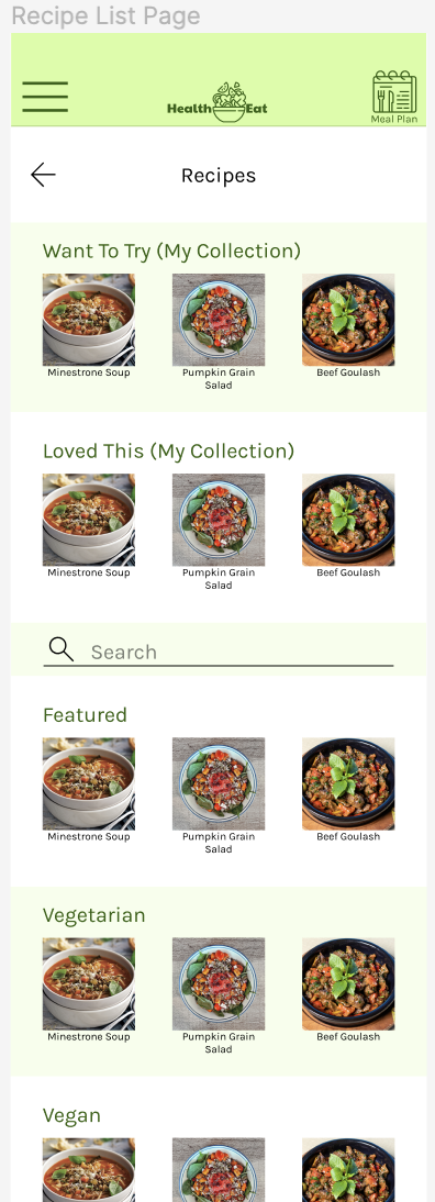
Following some confusion about the saving/add to collection
feature, I changed the ‘Save Recipe’ button to ‘Add to a
Collection’ on the ‘Recipe Page’. I then included each of these
collections at the top of the page on the ‘Recipe List Page’ so
that users know which of their collections they’re looking at,
rather than just the ‘Saved Recipes’ scroller I originally had.
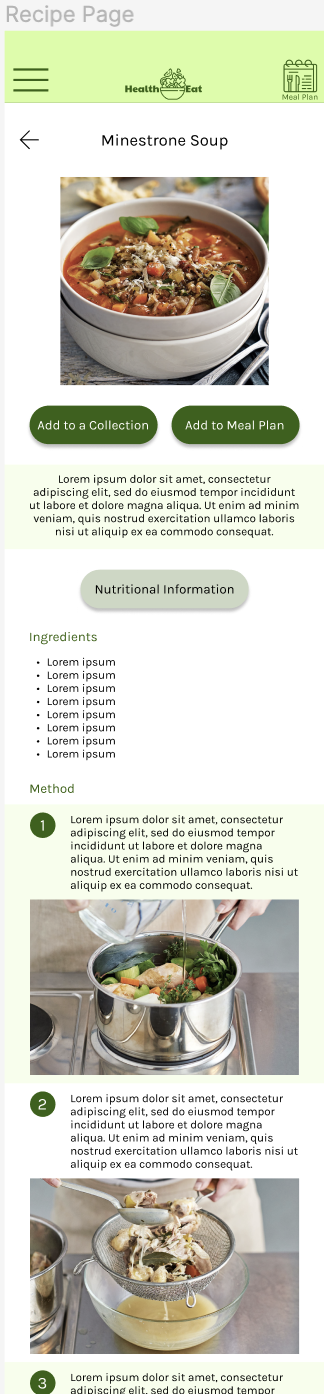
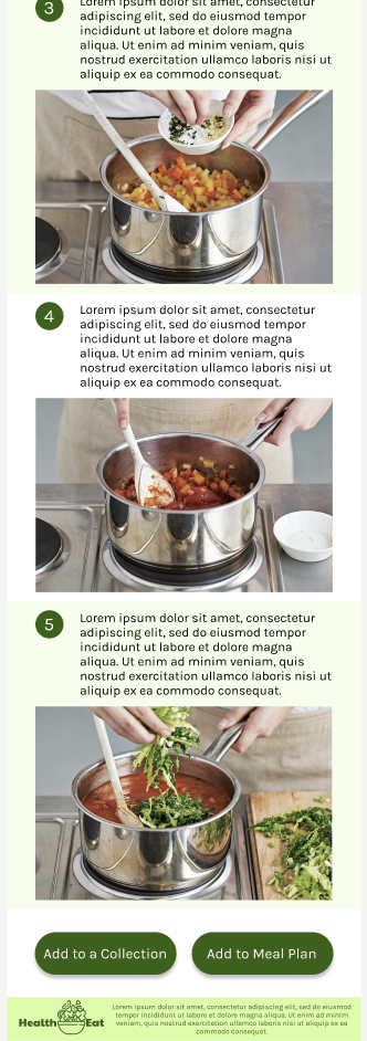
I then included each of these collections at the top of the page on the ‘Recipe List Page’ so that users know which of their collections they’re looking at, rather than just the ‘Saved Recipes’ scroller I originally had.
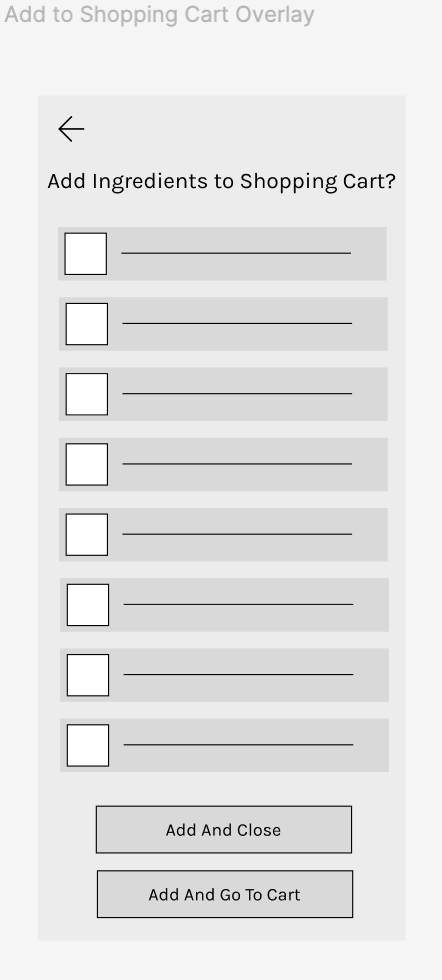
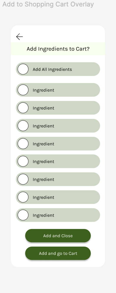
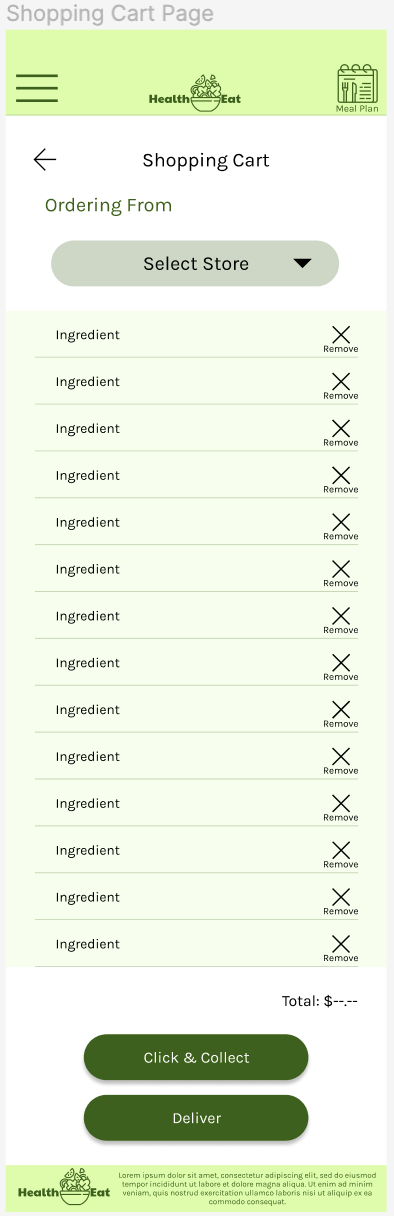
Add to shopping cart overlay
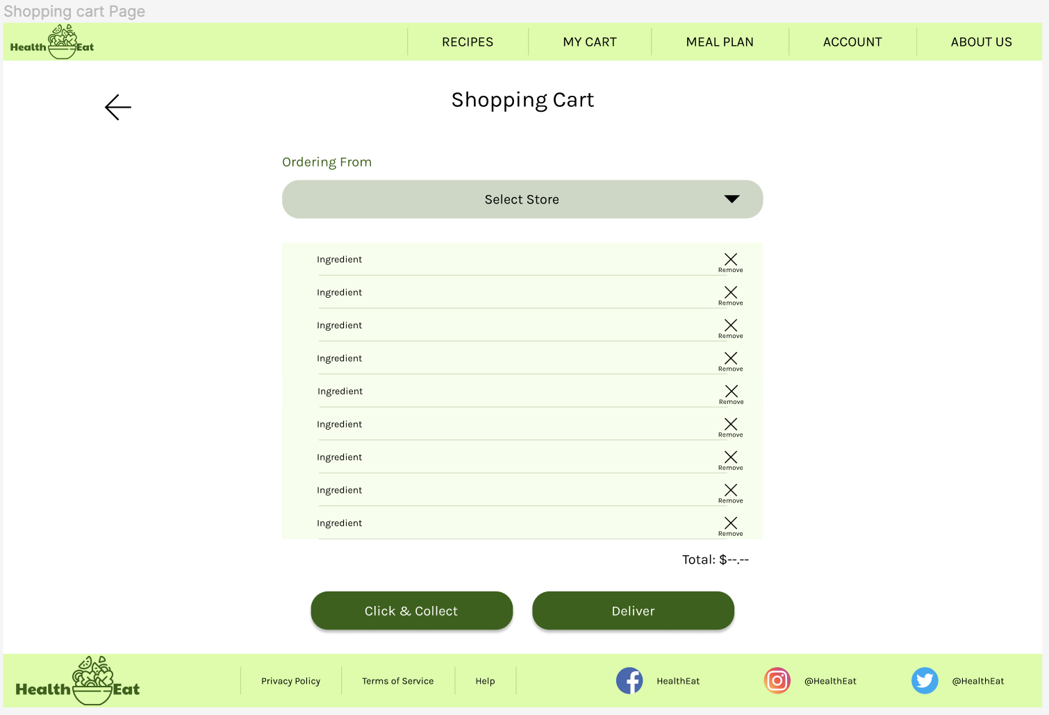
Following requests for an ‘add all ingredients’ button I have added this button at the top of the ingredients list so that users selecting all or most ingredients do not have to spend time clicking through each ingredient.
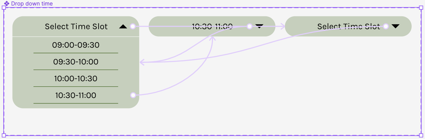
Drop down buttons
Another main issue that was fixed was the ability to click on the whole bar to action drop down menus, rather than having to specifically click the arrow icon.
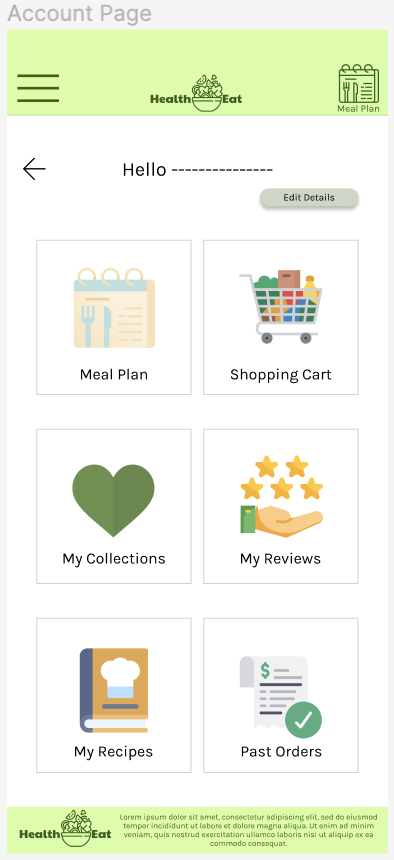
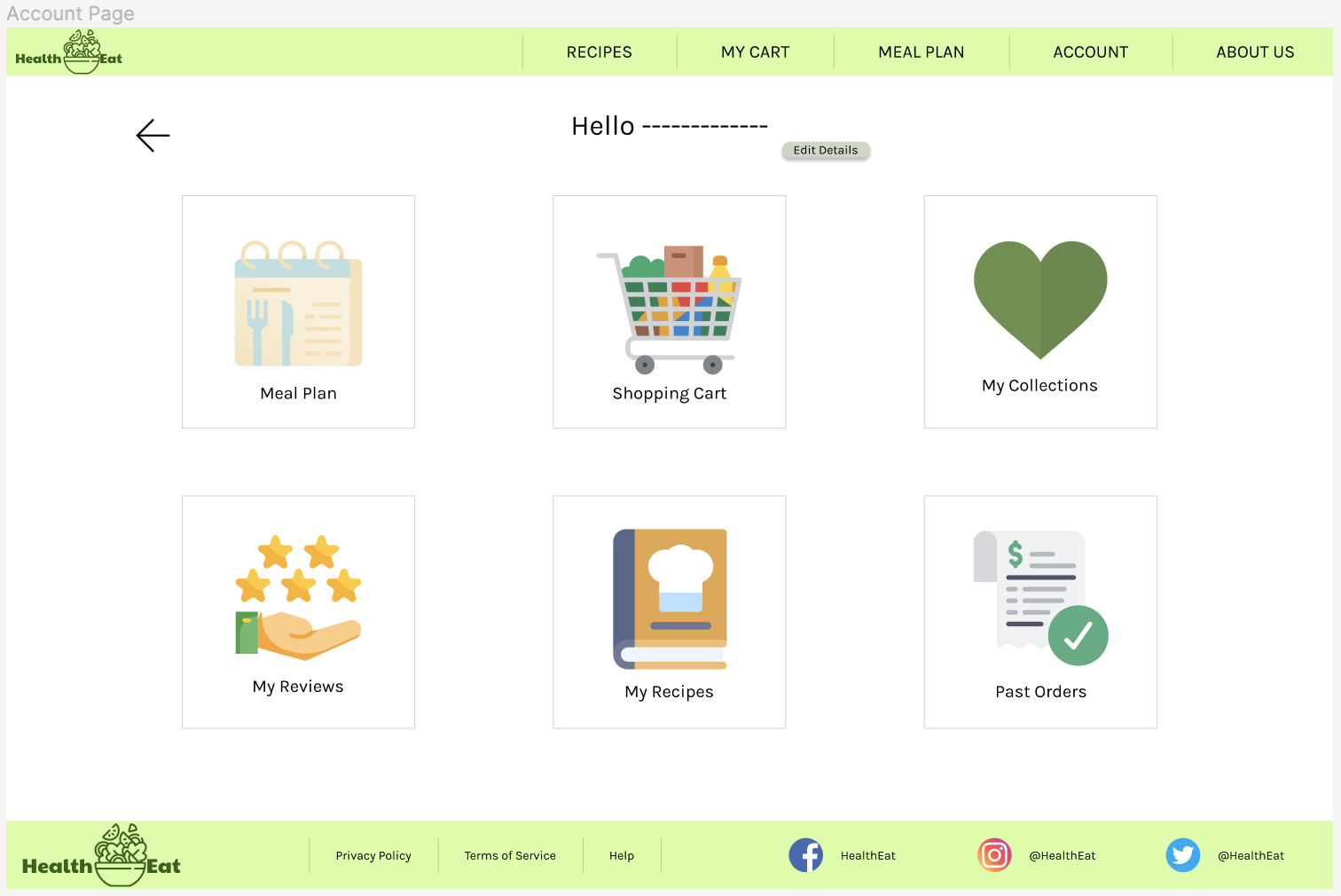
Account page
Meal Plan Page
My Cart Page
Stickersheets
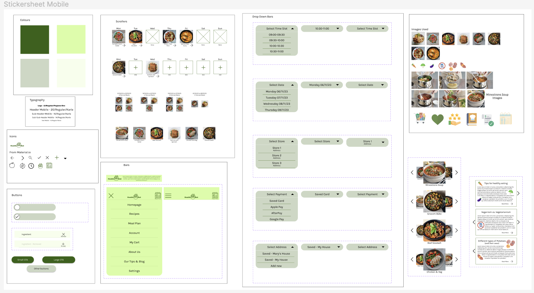
Stickersheet Mobile
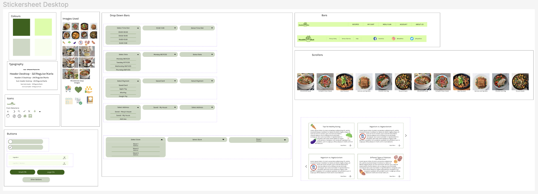
Stickersheet Desktop
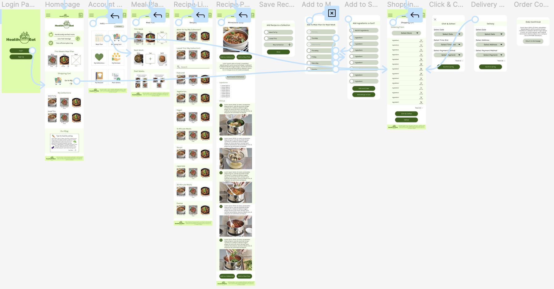
High-Fidelity Prototype
High-Fidelity Prototype Mobile
High-Fidelity Prototype Desktop
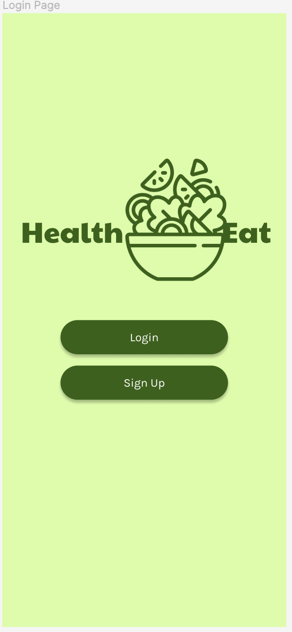
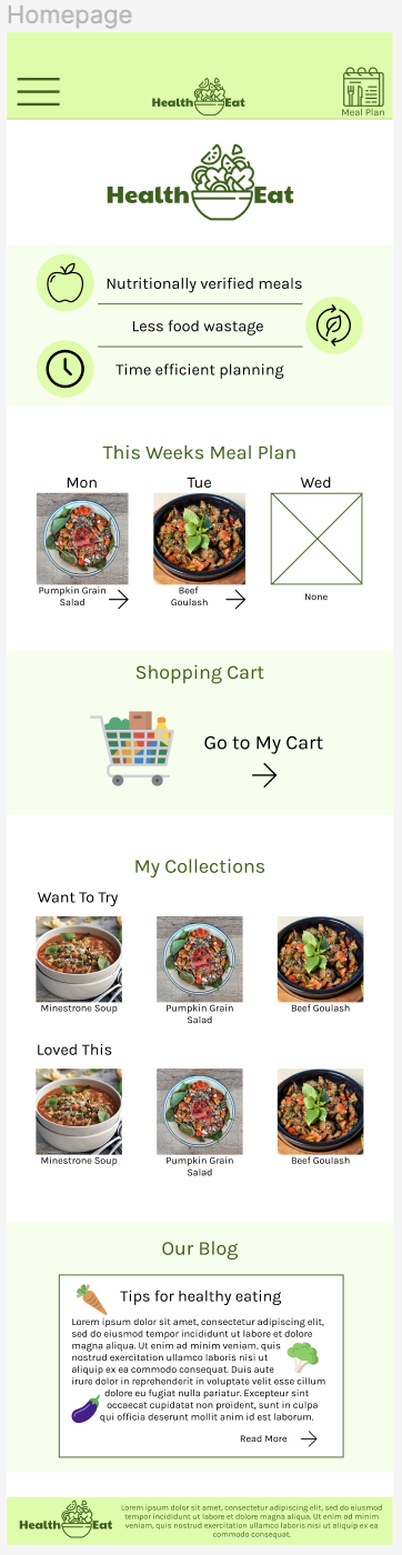
Mobile App Modifications
Mobile Application Design
The app design is exactly the same as the mobile website with an added login screen, and modifications to the homepage so that the user has the key prompts as soon as they login. Furthermore click carousels have been converted to scrollers.
Mobile Homepage
App Homepage
Mobile App High-Fidelity Prototype
Accessibility Considerations
-
1
All key call to action buttons have been made to be the same shape and a darker colour with white font to ensure these buttons are visible, and to draw users to these buttons.
-
2
All text and background colours have been checked and pass the WCAG AA contrast standards to ensure visibility for users.
-
3
On the account page, icons and their respective texts have been used to indicate actions to certain button.
Going Forward
Takeaways
Impact
The cross-platform responsive website/mobile application is designed for young adults to learn how to cook healthier meals. Not only does this tool benefit ‘young adults’, but it can be used by a range of users to help with healthy eating and cooking. There are several unique features including adding recipes to collections, and adding ingredients to a shopping cart to order, as well as customizing your meal plans.
"I like that the plus on the day shows that you don’t have anything there, and that if you click on it it takes you to the recipes" - Usability Study Participant
What I Learned
Even after completing several rounds of testing, there’ll always be things i want to improve on and oftentimes products will not feel finished unless it has been developed by engineers and served up to the public. Even then, I’ll probably feel that that I can improve an app or website, especially as I develop as a UX designer, and learn new techniques.
Next Steps
-
1
Designing less important pages for the complete design of the website/app before hand-off to developers. -
2
Conducting further research and usability studies to insure no further necessary improvements need to be made before development.